
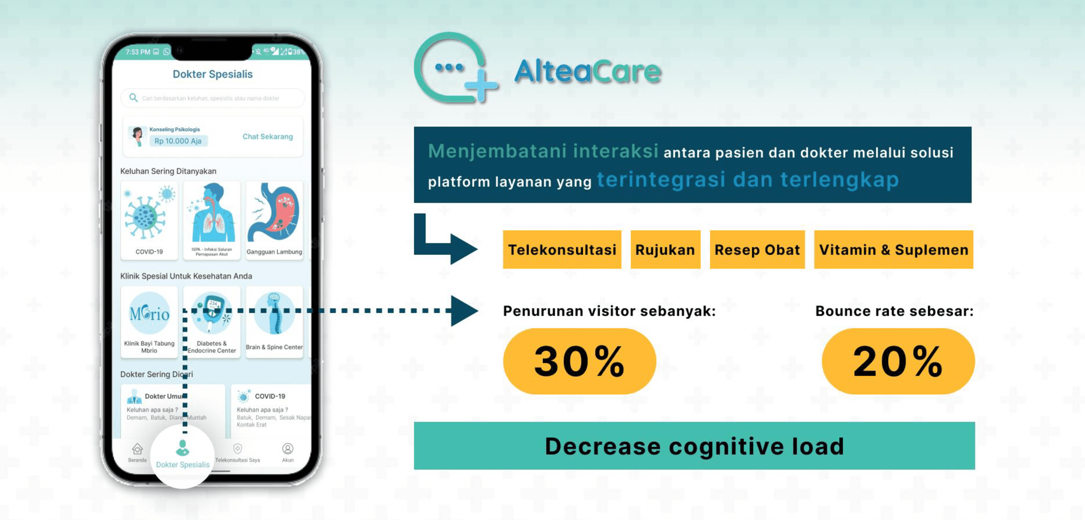
Mobile App and Landing Page of AlteaCare
AlteaCare is a comprehensive Indonesian health technology platform that serves as a digital bridge between patients and hospital-based specialists. Launched in 2021 by PT Sehat Digital Nusantara, it is an integral part of the Mitra Keluarga digital ecosystem.
Client:
AlteaCare
Year:
2022
Type:
Website
Role:
UI/UX Designer
Problem Statement
Users struggle to find and book specialists because the landing page and mobile app feel cluttered and confusing. This friction leads to a poor experience that forces users to abandon their medical needs mid-process.
Goal
I am redesigning the landing page and mobile app to simplify navigation and create a direct path to doctor consultations. By removing these pain points, I ensure a fast, intuitive journey that directly serves the user.
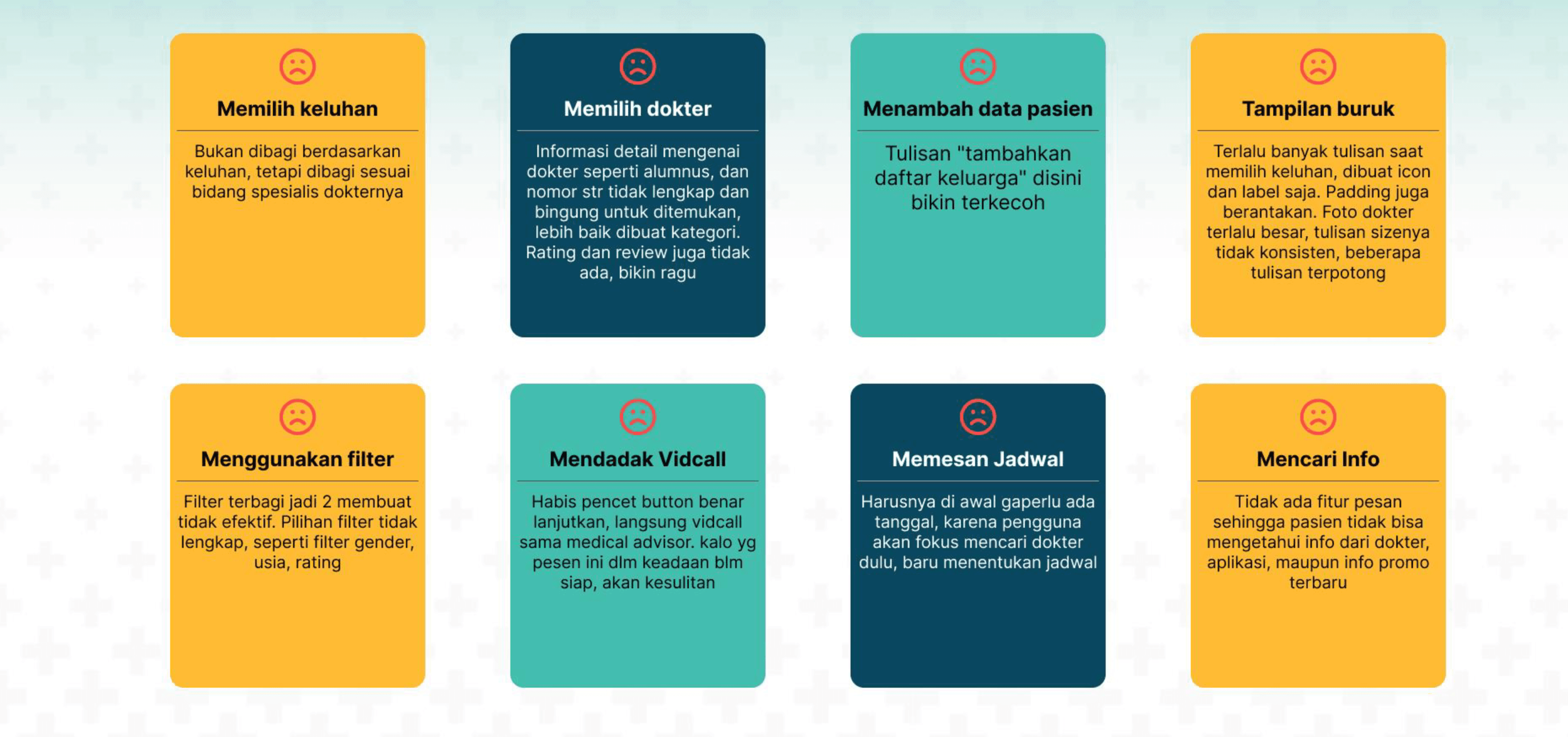
Pain Point
Users struggle to find the right doctor and complete a booking because the app's categories are confusing, doctor information is incomplete, the interface is messy, and the steps are out of order making the whole experience feel frustrating and untrustworthy.
Define Problem
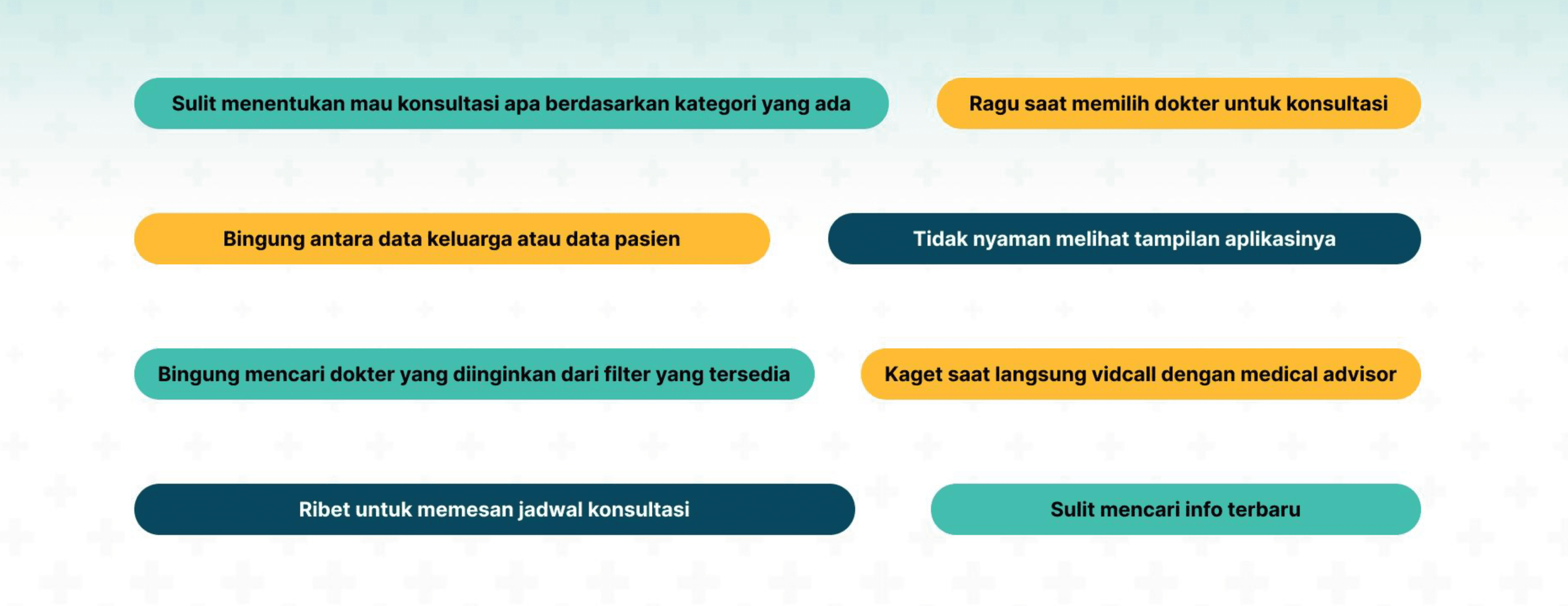
Users struggle to use AlteaCare confidently because unclear categories, incomplete doctor information, a messy interface, and a confusing booking flow create friction and doubt at every step preventing them from completing a consultation with ease.
Room For Improvement
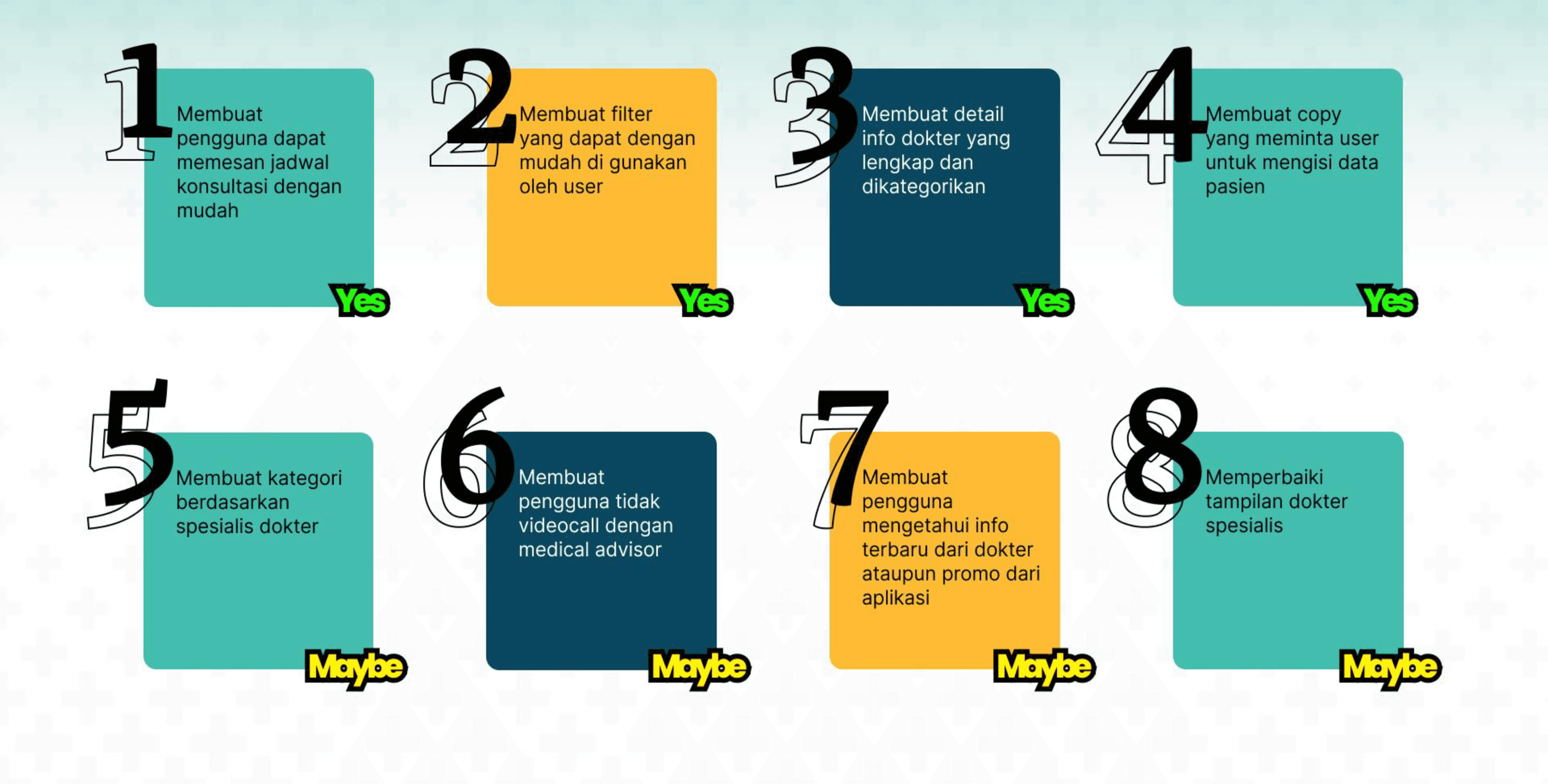
The focus went first on fixing the core booking flow scheduling, filtering, doctor info, and data input since these directly blocked users from completing a consultation. The secondary improvements would enhance the overall experience but did not need to be addressed first.
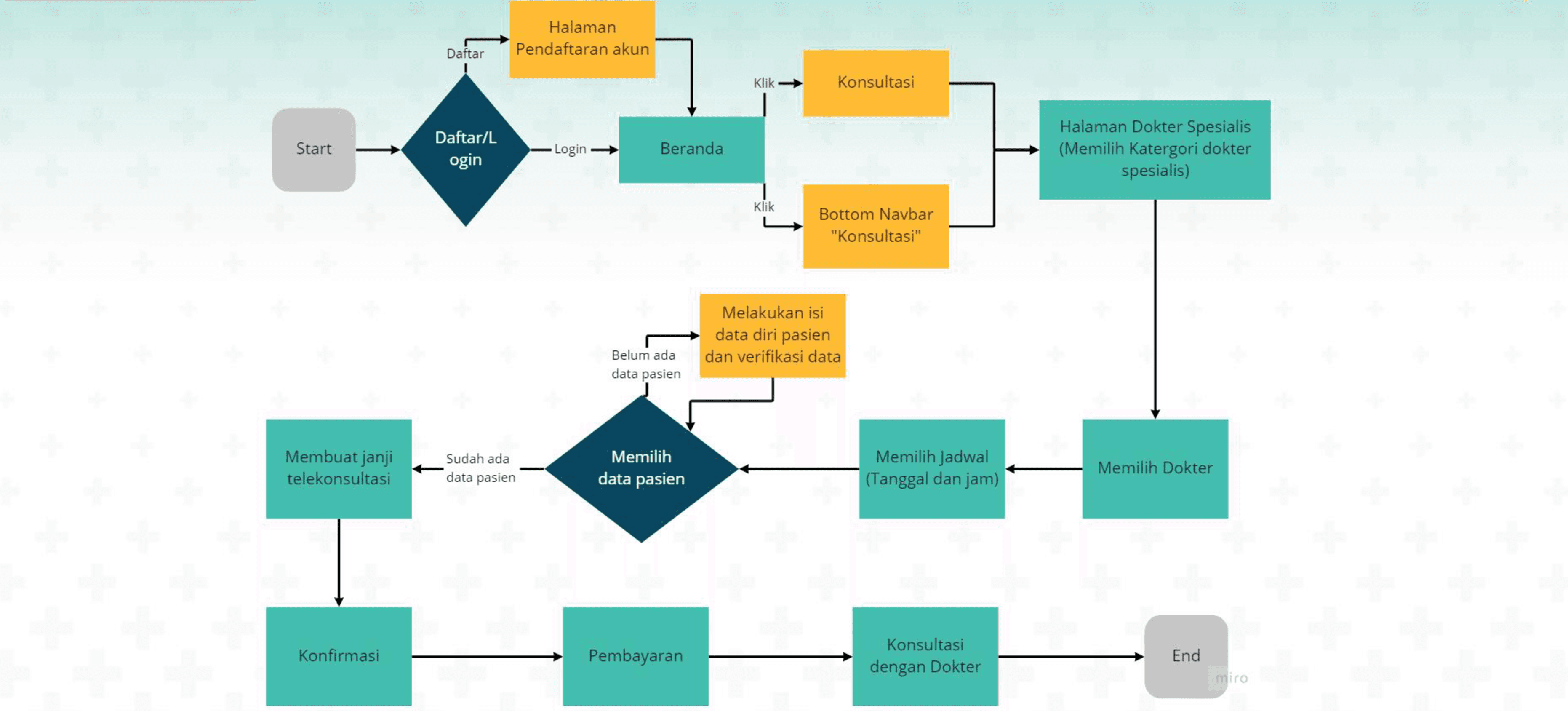
User Flow
The redesigned flow puts doctor selection before schedule selection, fixing the original backwards sequence. Patient data is handled as a conditional step only shown when needed so the flow stays smooth and uninterrupted for returning users.
Wireframe
Each wireframe screen directly addresses a specific pain point from a complete filter and trustworthy doctor profiles, to clearer patient data input and a full booking summary giving users a smoother and more confident experience throughout.

UI Design Before
The original UI had the right screens but executed them poorly cluttered layouts, weak information hierarchy, and inconsistent visuals made it hard for users to feel confident at any stage of the booking process.
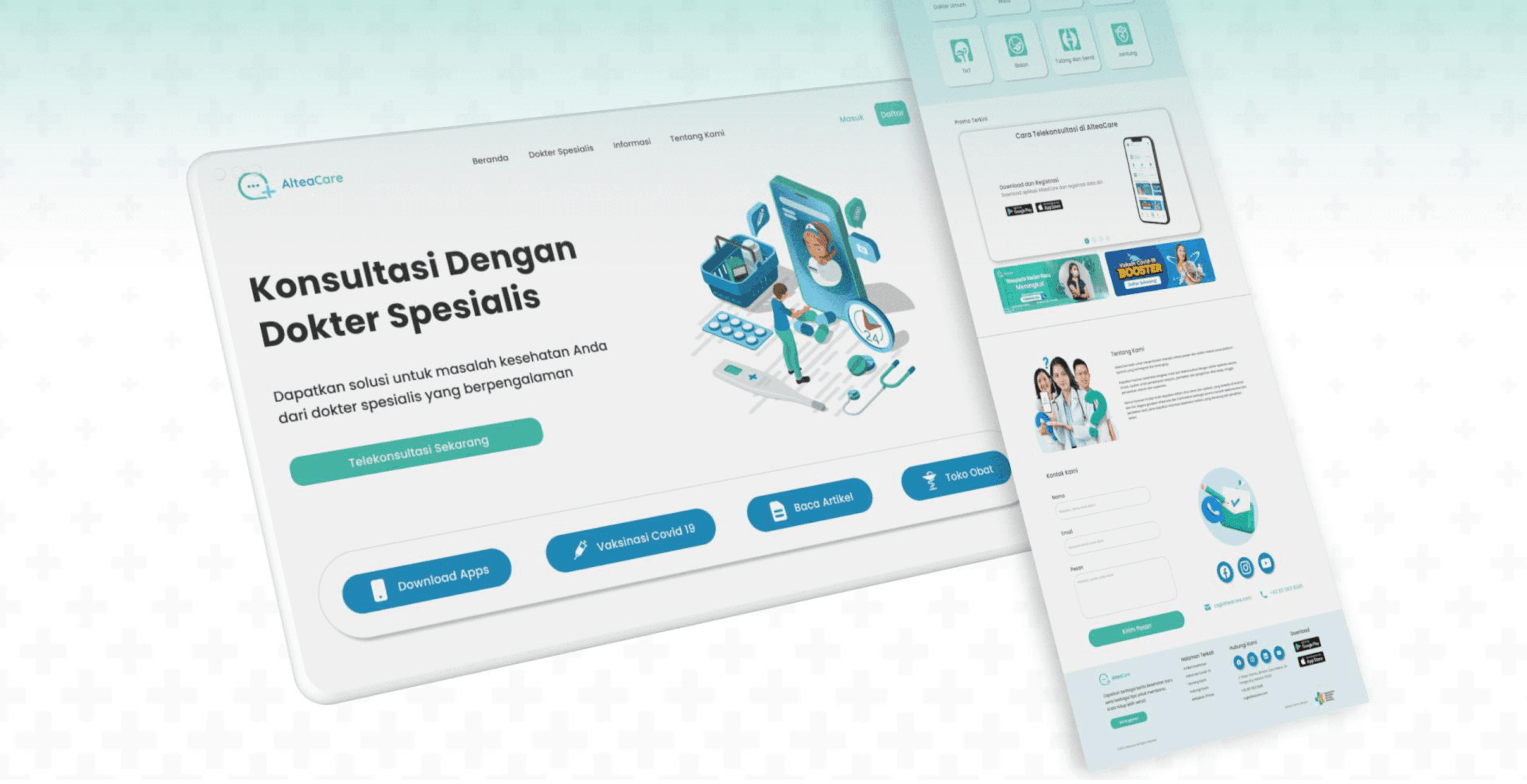
UI Design After (Landing Page)
The redesigned landing page gives users a clear starting point, surfaces key information upfront, and builds trust through structured content making it easier to understand what AlteaCare offers and how to get started.
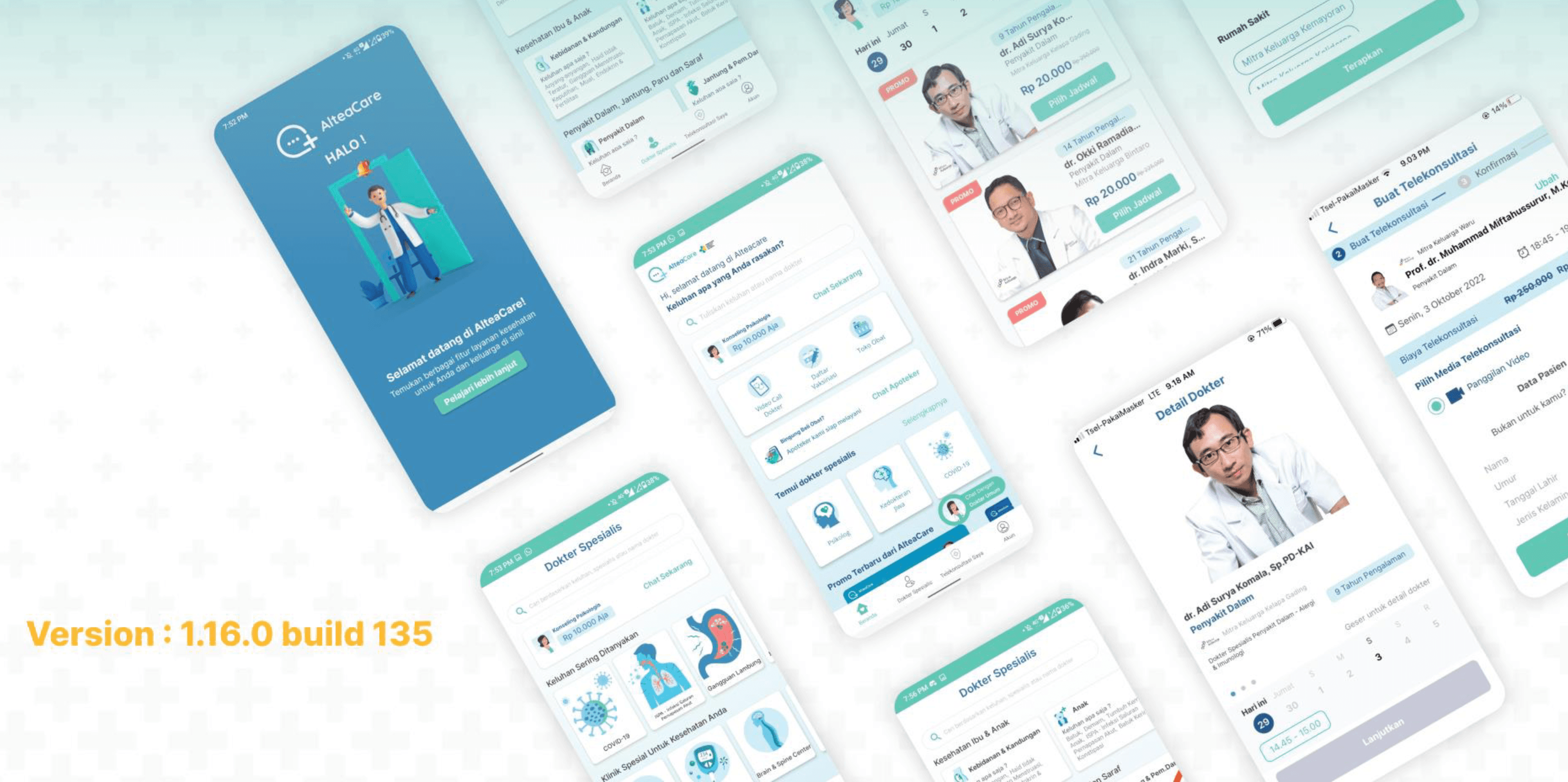
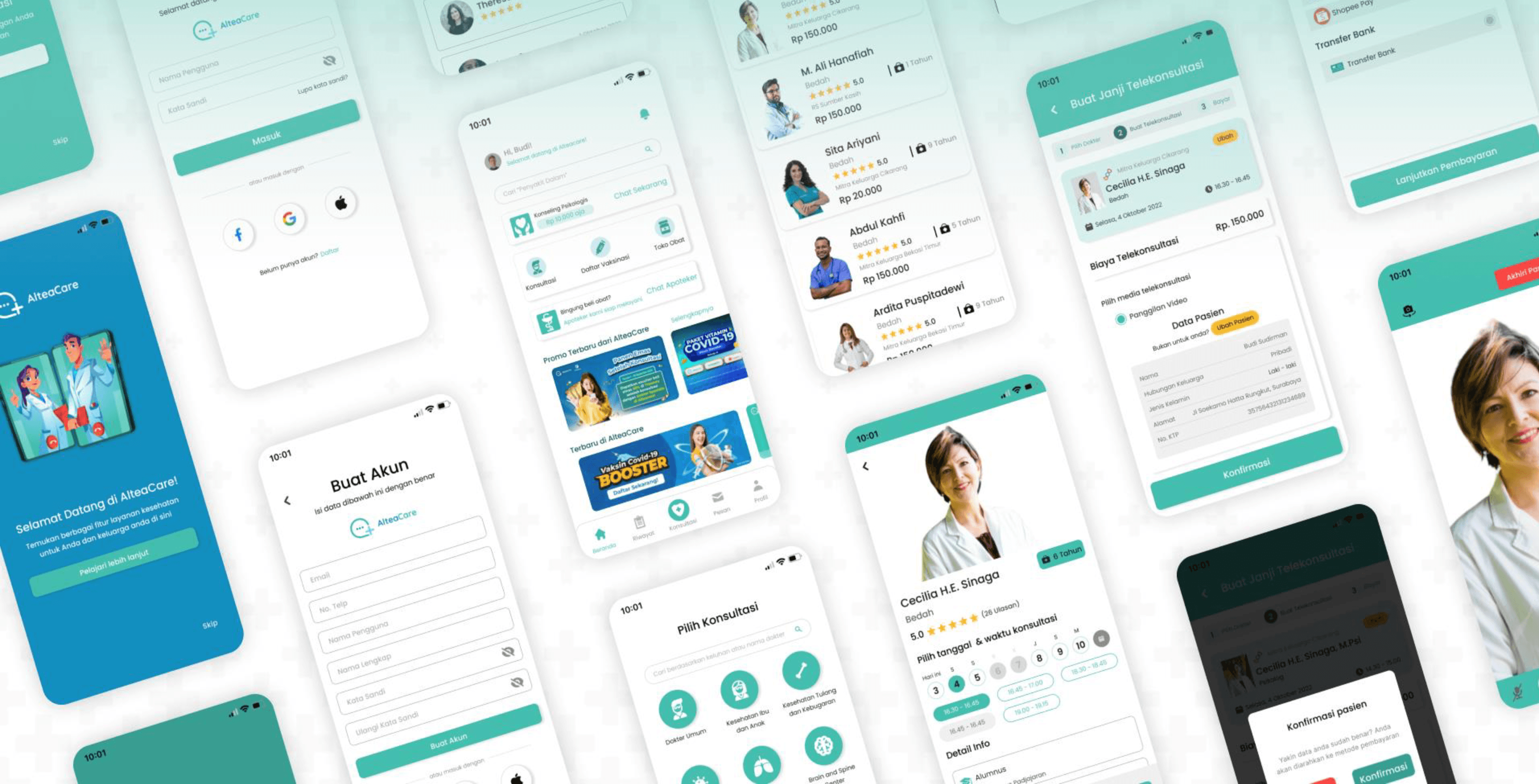
UI Design After (Mobile App)
The redesigned mobile UI directly fixes every major pain point. Clearer categories, complete doctor profiles with trust signals, a logical booking flow, and a confirmation step before video calls all work together to deliver an experience that feels organized, trustworthy, and easy to navigate from start to finish.
Conclusion
This was an interesting project to work on because the stakes felt higher than usual. When someone is trying to find and book a doctor, the last thing they should have to deal with is a confusing interface. Getting the flow in the right order, filling in the missing information on doctor profiles, and cleaning up the overall experience was what this redesign came down to.
What I Learned
Flow order matters more than it seems. Doctor selection coming after schedule selection sounds minor but it genuinely confused users. Fixing that one sequence changed how the whole thing felt to use.
In a health app, trust is everything. Incomplete doctor profiles aren't just a visual problem, they make users doubt whether they're in the right place. That was one of the most impactful things to fix.
Prioritizing what to fix first is its own skill. Not everything needed fixing equally. Learning to focus on what was actually blocking users from completing a booking, before anything else, was something this project taught me to think about more deliberately.
Mobile App and Landing Page of AlteaCare
AlteaCare is a comprehensive Indonesian health technology platform that serves as a digital bridge between patients and hospital-based specialists. Launched in 2021 by PT Sehat Digital Nusantara, it is an integral part of the Mitra Keluarga digital ecosystem.
Client:
AlteaCare
Year:
2022
Type:
Website
Role:
UI/UX Designer
Problem Statement
Users struggle to find and book specialists because the landing page and mobile app feel cluttered and confusing. This friction leads to a poor experience that forces users to abandon their medical needs mid-process.
Goal
I am redesigning the landing page and mobile app to simplify navigation and create a direct path to doctor consultations. By removing these pain points, I ensure a fast, intuitive journey that directly serves the user.
Pain Point
Users struggle to find the right doctor and complete a booking because the app's categories are confusing, doctor information is incomplete, the interface is messy, and the steps are out of order making the whole experience feel frustrating and untrustworthy.
Define Problem
Users struggle to use AlteaCare confidently because unclear categories, incomplete doctor information, a messy interface, and a confusing booking flow create friction and doubt at every step preventing them from completing a consultation with ease.
Room For Improvement
The focus went first on fixing the core booking flow scheduling, filtering, doctor info, and data input since these directly blocked users from completing a consultation. The secondary improvements would enhance the overall experience but did not need to be addressed first.
User Flow
The redesigned flow puts doctor selection before schedule selection, fixing the original backwards sequence. Patient data is handled as a conditional step only shown when needed so the flow stays smooth and uninterrupted for returning users.
Wireframe
Each wireframe screen directly addresses a specific pain point from a complete filter and trustworthy doctor profiles, to clearer patient data input and a full booking summary giving users a smoother and more confident experience throughout.
UI Design Before
The original UI had the right screens but executed them poorly cluttered layouts, weak information hierarchy, and inconsistent visuals made it hard for users to feel confident at any stage of the booking process.
UI Design After (Landing Page)
The redesigned landing page gives users a clear starting point, surfaces key information upfront, and builds trust through structured content making it easier to understand what AlteaCare offers and how to get started.
UI Design After (Mobile App)
The redesigned mobile UI directly fixes every major pain point. Clearer categories, complete doctor profiles with trust signals, a logical booking flow, and a confirmation step before video calls all work together to deliver an experience that feels organized, trustworthy, and easy to navigate from start to finish.
Conclusion
This was an interesting project to work on because the stakes felt higher than usual. When someone is trying to find and book a doctor, the last thing they should have to deal with is a confusing interface. Getting the flow in the right order, filling in the missing information on doctor profiles, and cleaning up the overall experience was what this redesign came down to.
What I Learned
Flow order matters more than it seems. Doctor selection coming after schedule selection sounds minor but it genuinely confused users. Fixing that one sequence changed how the whole thing felt to use.
In a health app, trust is everything. Incomplete doctor profiles aren't just a visual problem, they make users doubt whether they're in the right place. That was one of the most impactful things to fix.
Prioritizing what to fix first is its own skill. Not everything needed fixing equally. Learning to focus on what was actually blocking users from completing a booking, before anything else, was something this project taught me to think about more deliberately.