
Website of Furnfice - Furniture Office Marketplace
Furnifice is my thesis project, a marketplace platform built to bring office furniture trade fully online. Instead of scattered listings and offline dealings, it brings sellers and buyers into one place where buyers can browse and purchase with ease, while sellers and admins get their own dedicated dashboards to manage inventory, orders, and users without the usual hassle.
Client:
Personal Project
Year:
2024
Type:
Website
Role:
UI/UX Designer
Problem Statment
Office furniture sellers lack online visibility to reach more buyers, while buyers face inaccurate product data, fragmented payments, and unreliable shipping.
Goal
Build a platform that expands seller reach through promotion tools and gives buyers accurate product info, secure payments, and reliable order tracking.
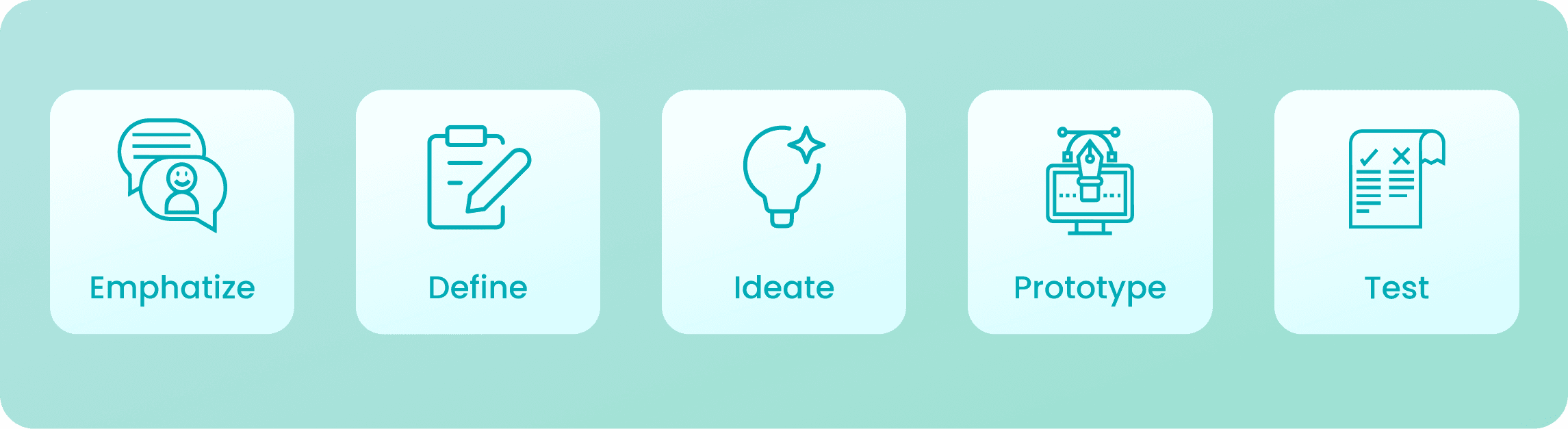
The Design Thinking Process
I used the Design Thinking process to deeply understand seller and buyer pain points, define the core problem, ideate the right solutions, prototype key user flows, and validate the design through testing.
Empathize
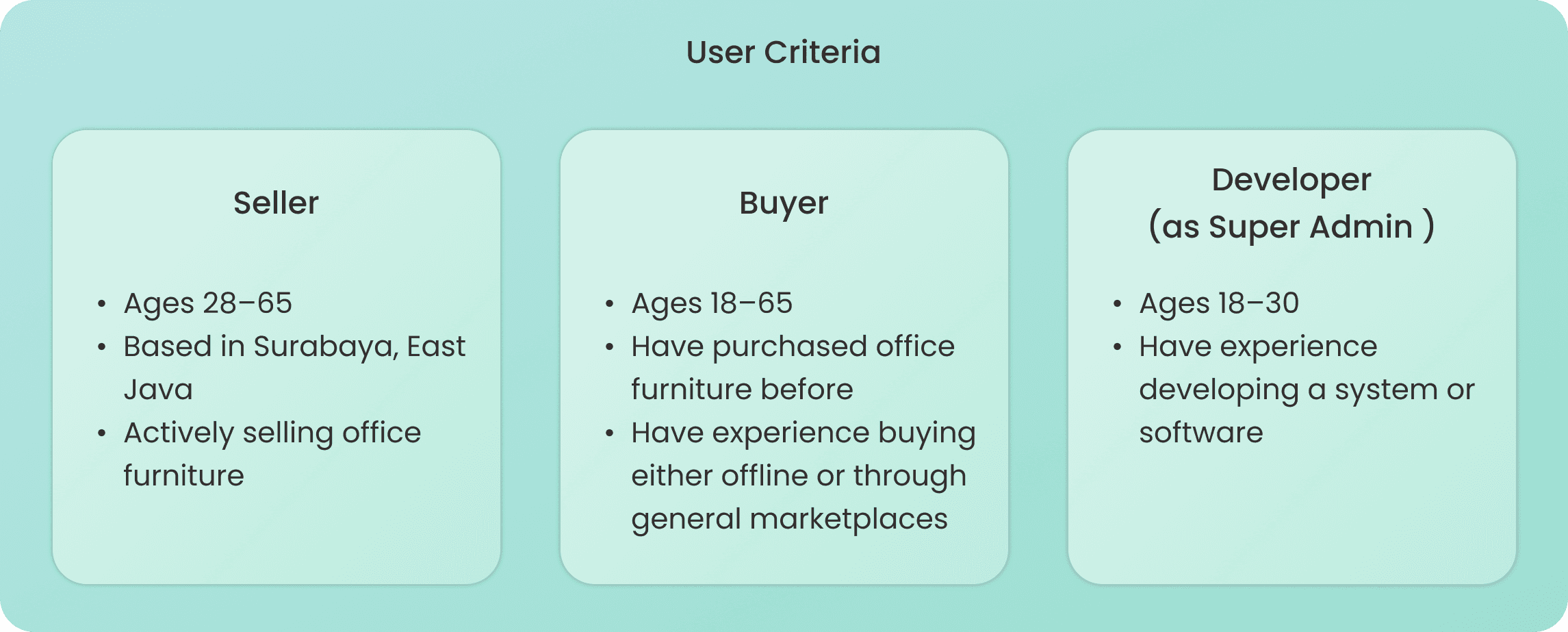
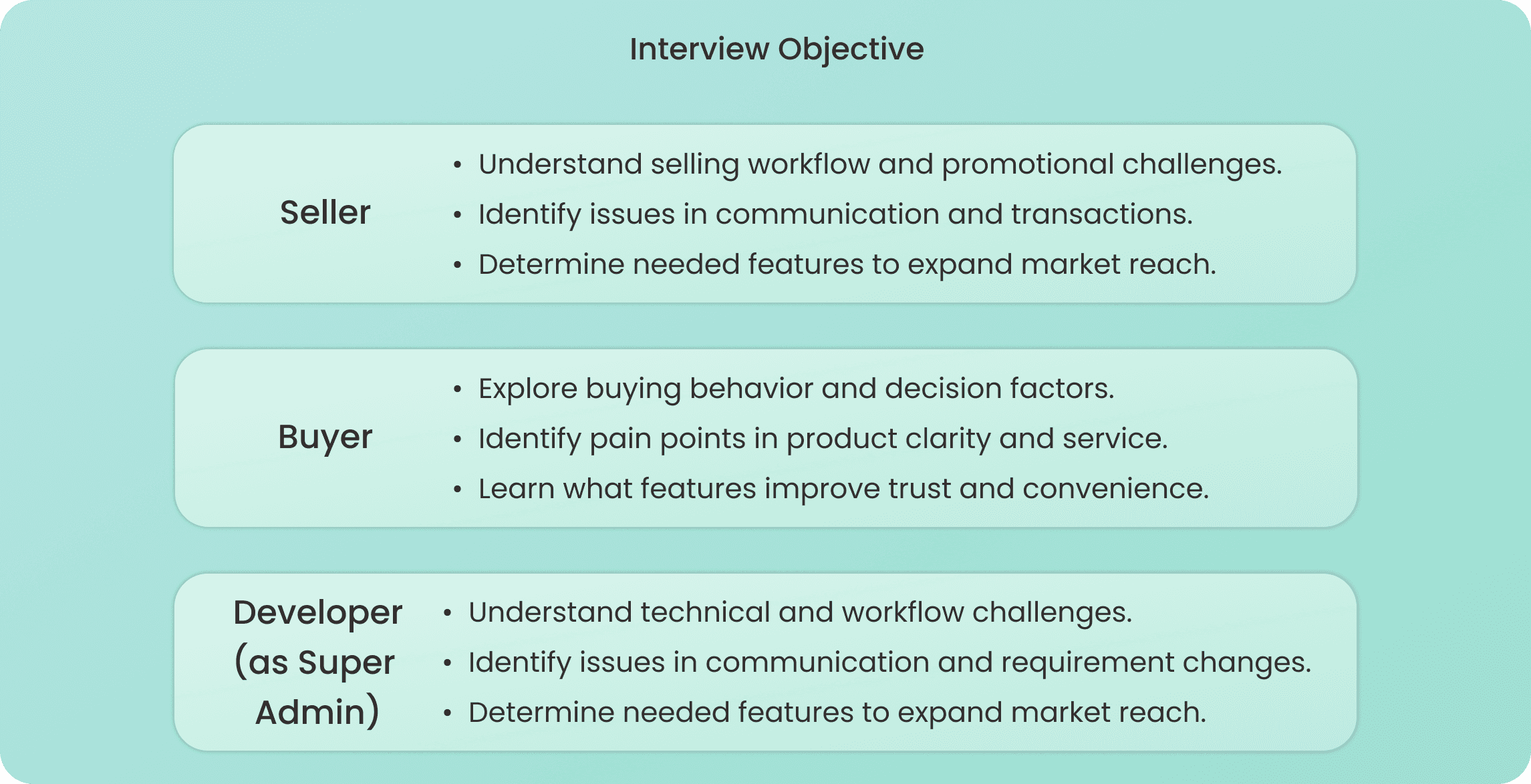
I interviewed Sellers struggling with limited market reach, Buyers frustrated with inaccurate product info and unreliable service, and Developers as Super Admin dealing with complex system and user management. Their pain points and needs were mapped through empathy maps to guide the design direction.
Understanding Users Through Interviews
I conducted 15 interviews per user across three user groups: Sellers, Buyers, and Developers as Super Admin, to uncover their workflow challenges, pain points, and feature needs as the design foundation.
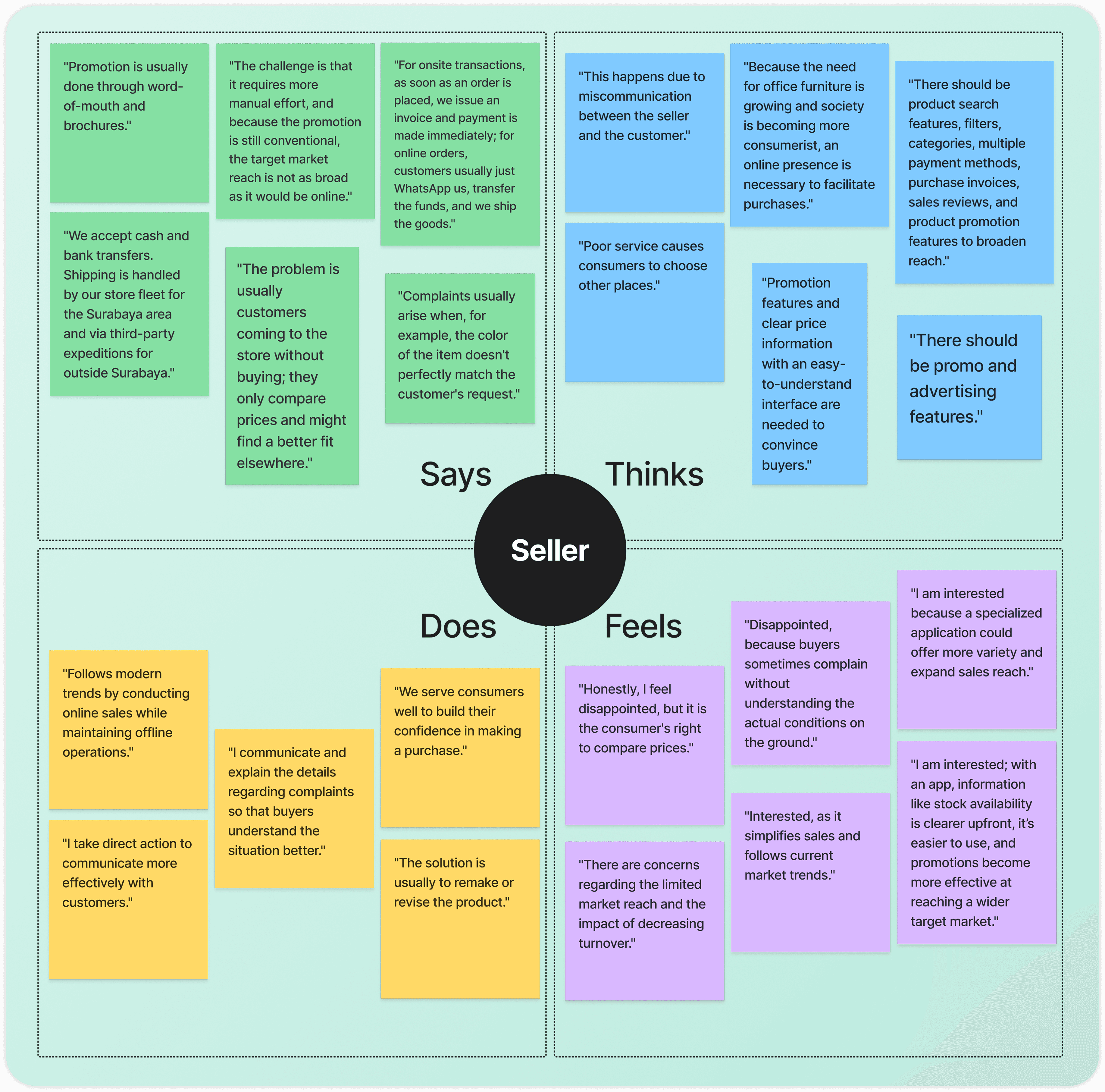
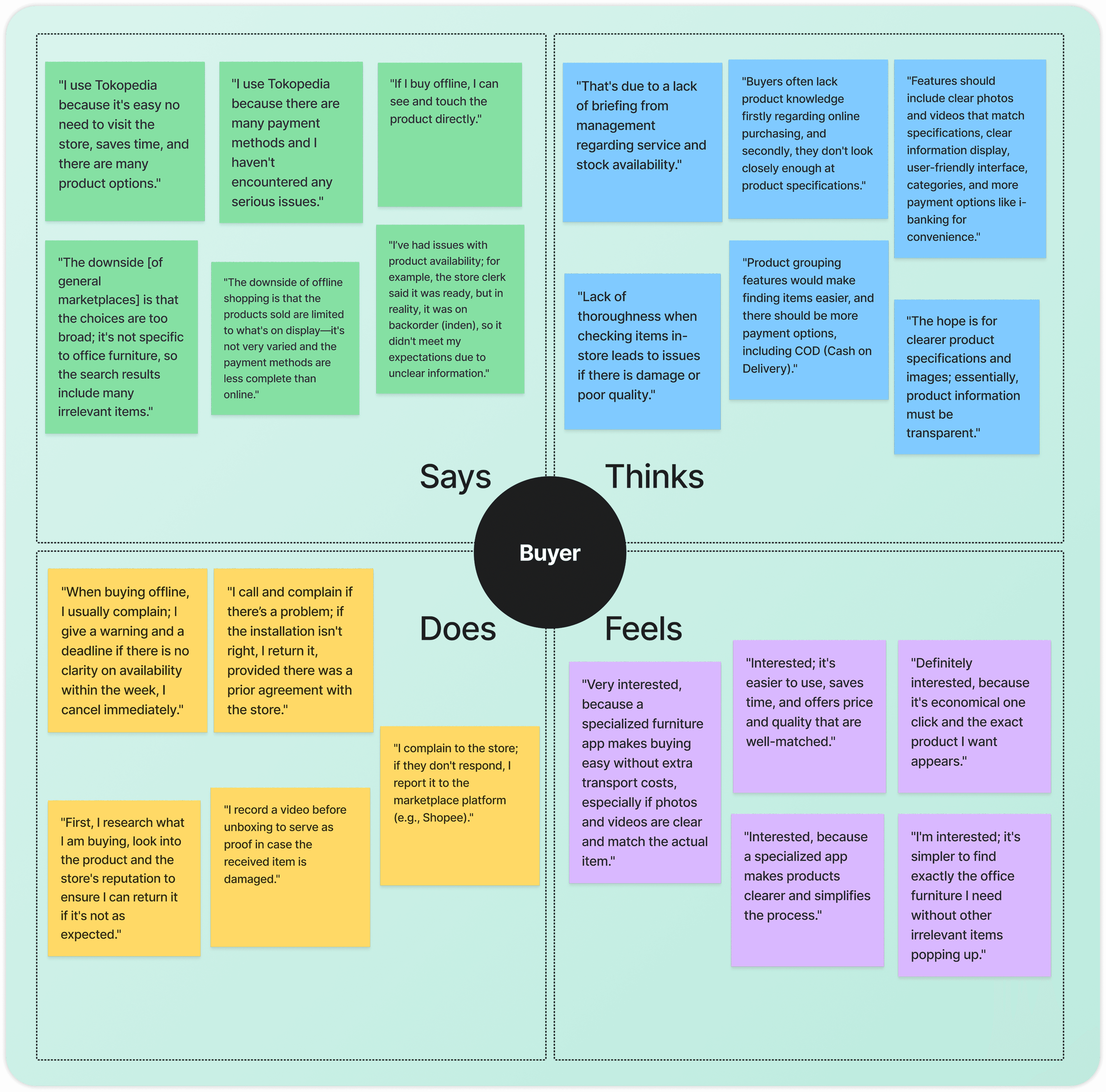
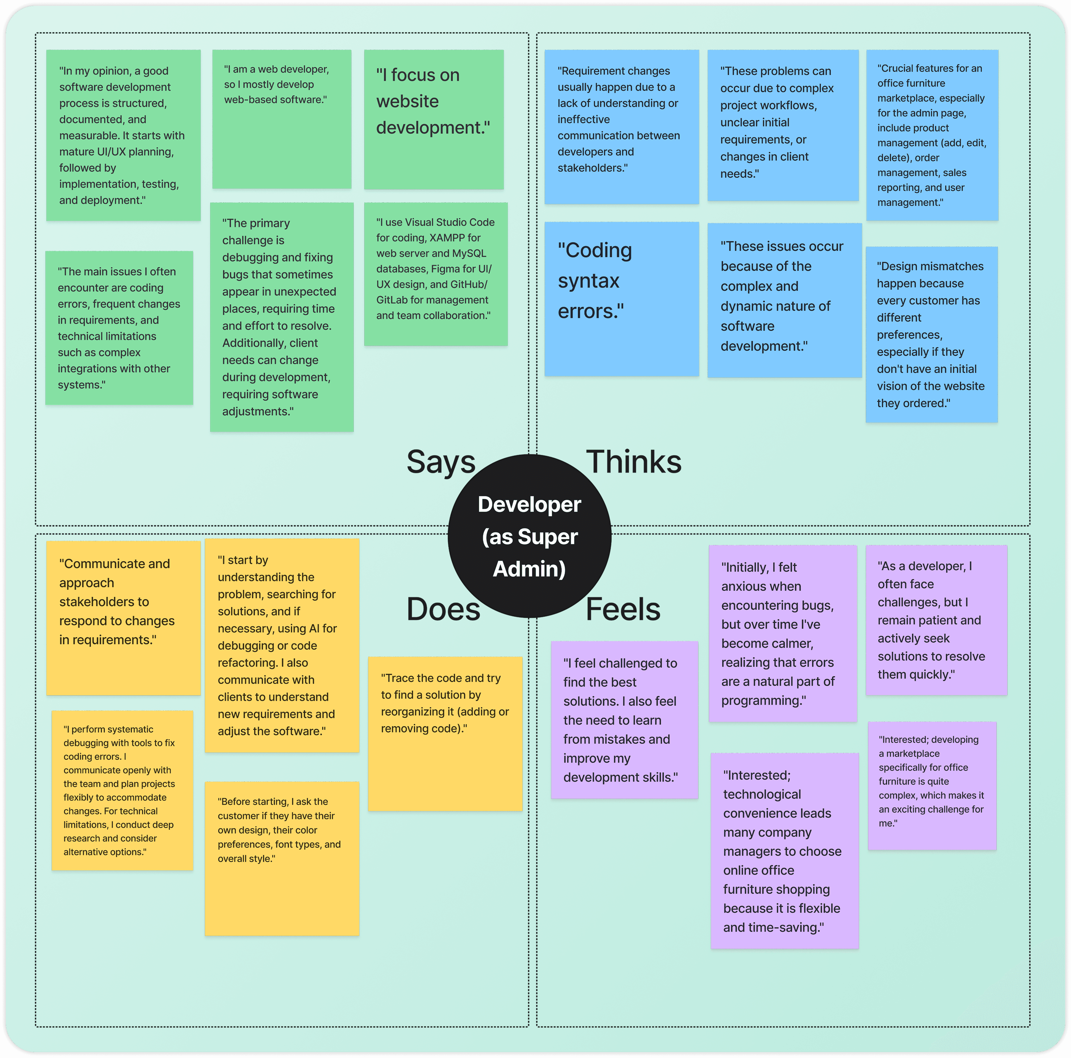
Empathy Map
I mapped what each user says, thinks, does, and feels to deeply understand their pain points and needs, revealing that Sellers need better reach and promo tools, Buyers need product clarity and reliable service, and Developers as Super Admin need a structured and manageable system.
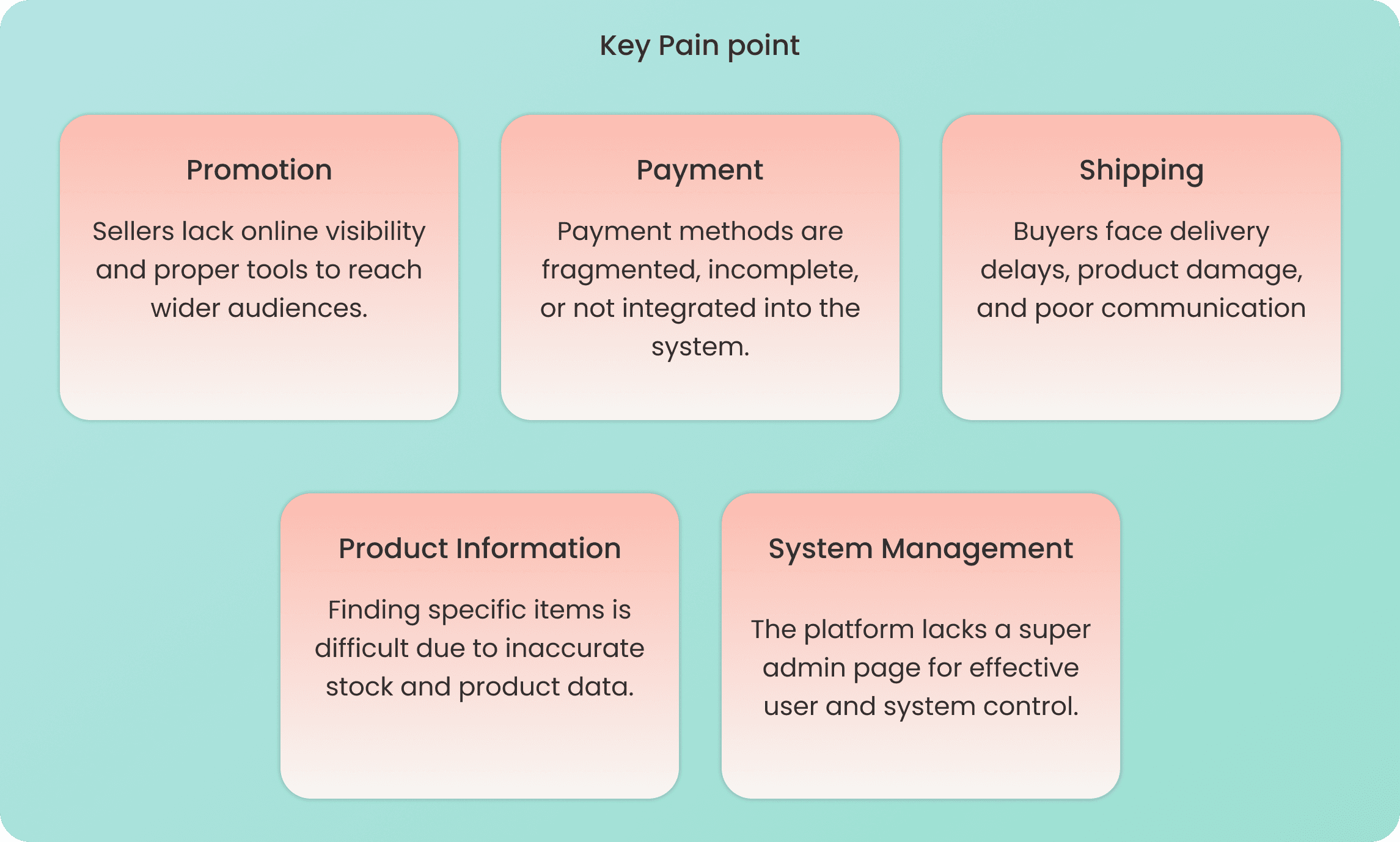
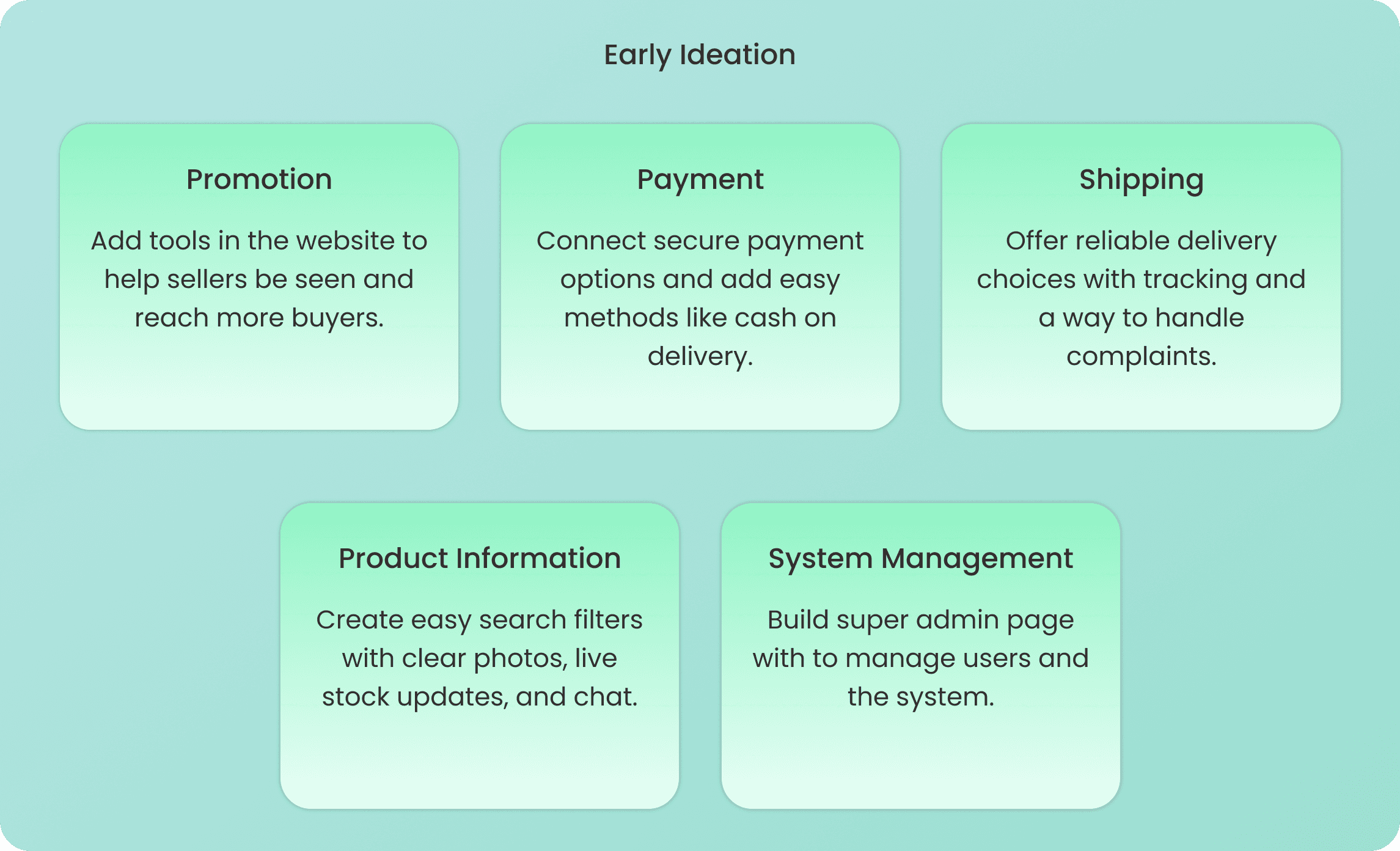
Define
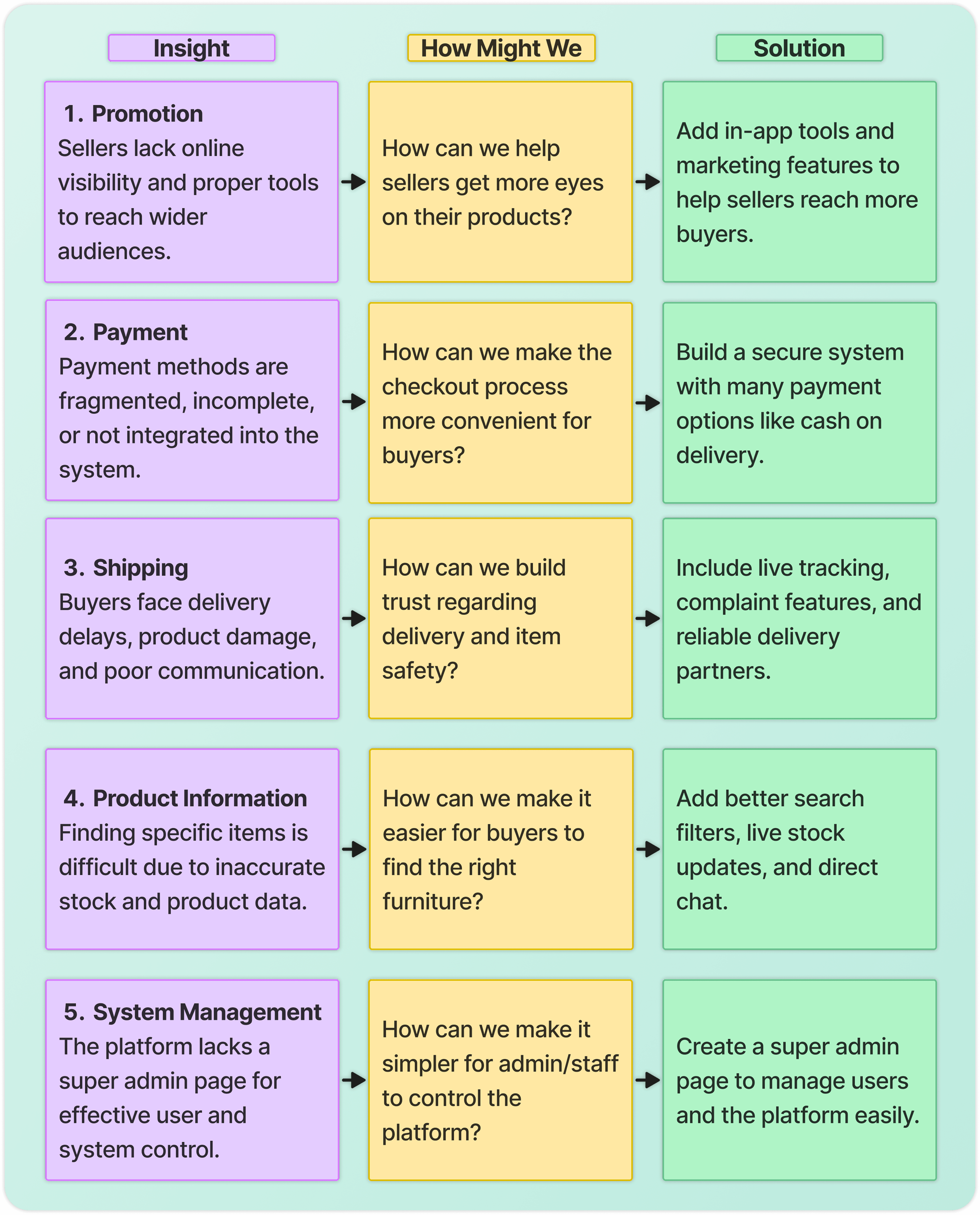
I identified five key pain points through an affinity diagram: Promotion, Payment, Shipping, Product Information, and System Management, then translated them into early ideation solutions and three user personas representing Sellers, Buyers, and Developers as Super Admin.
Affinity Diagram
I grouped research findings into five Key Pain Points: Promotion, Payment, Shipping, Product Information, and System Management, each matched with an Early Ideation solution to address the real needs of all three users.
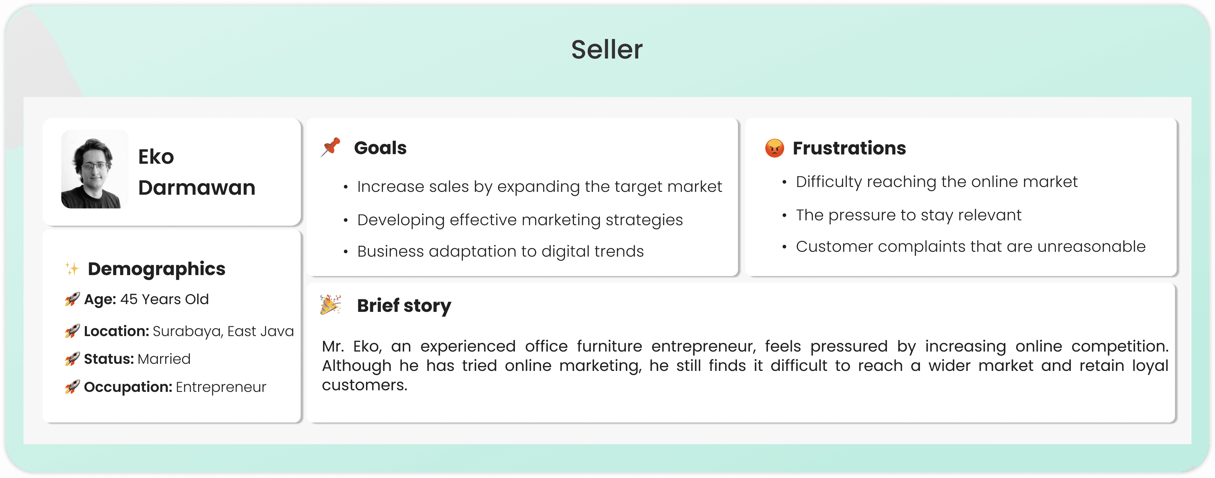
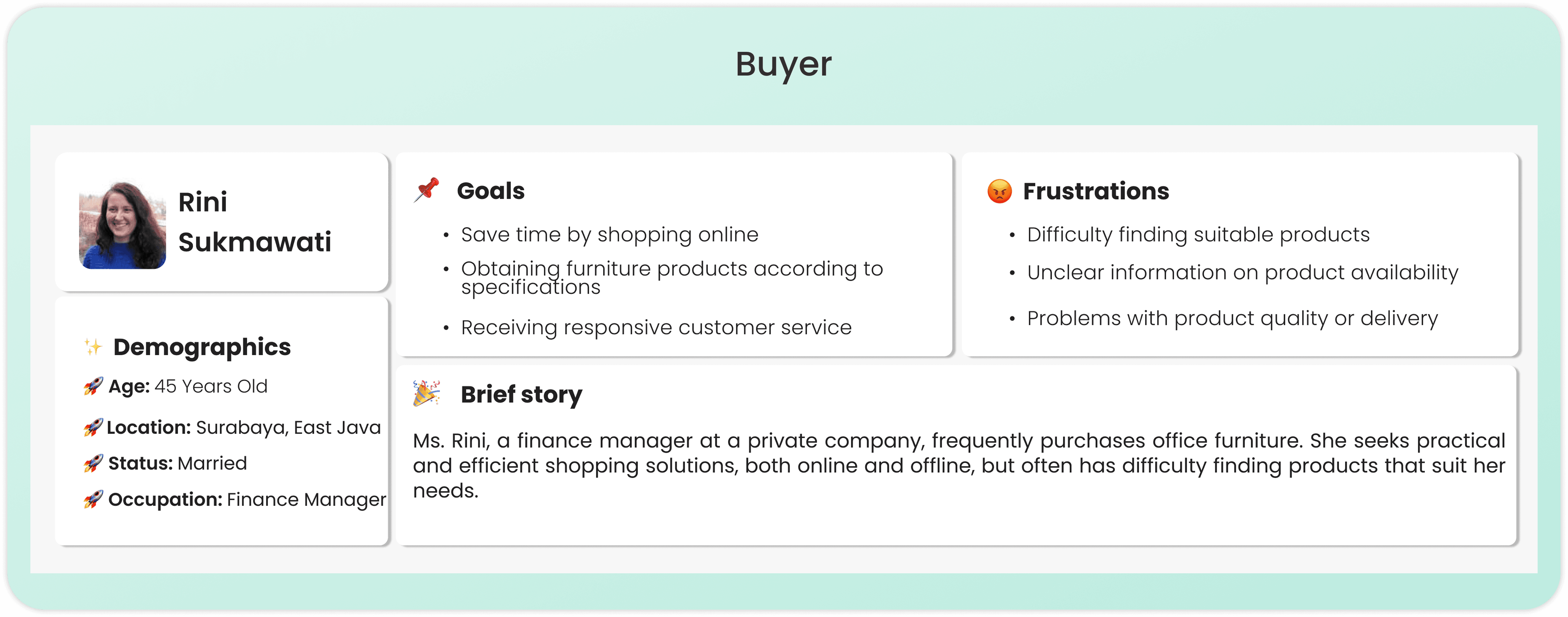
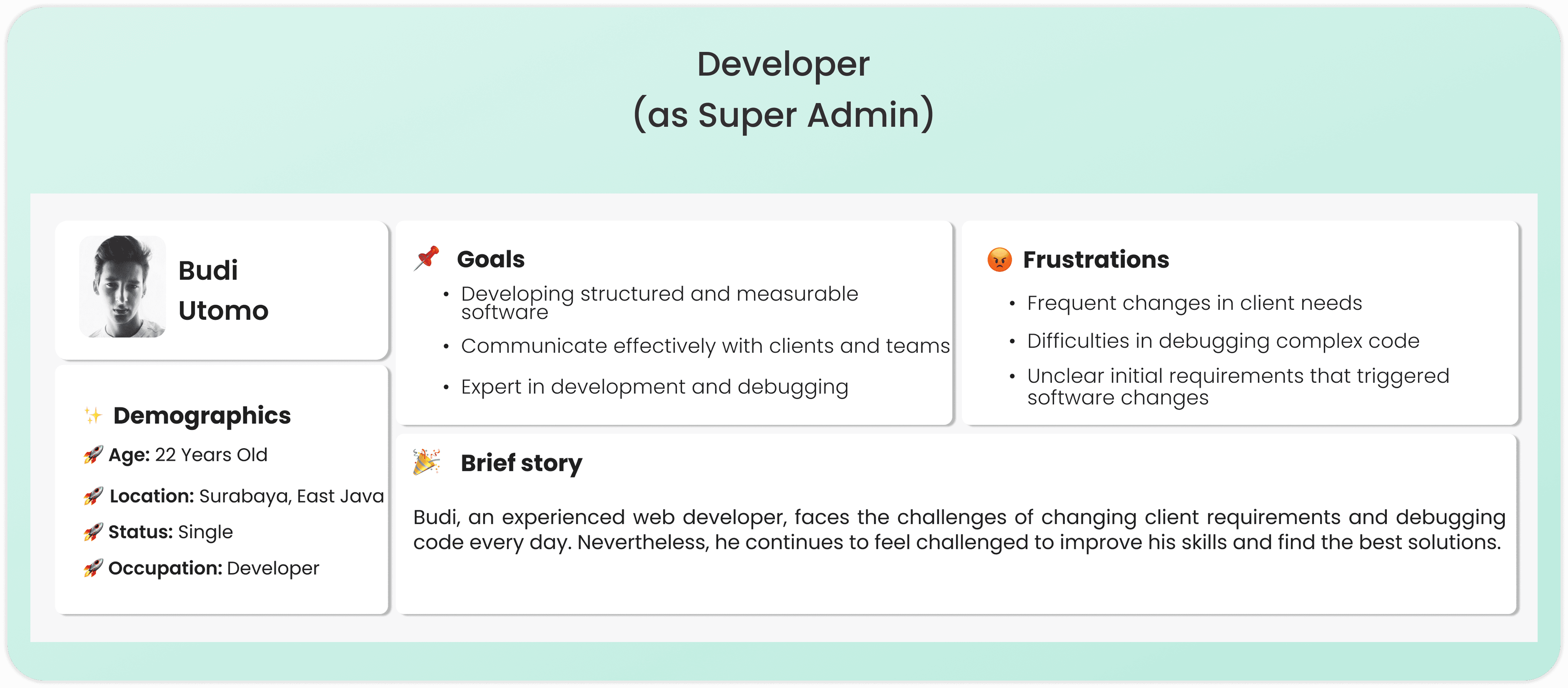
User Persona
I created three personas to humanize the research: Sellers with limited digital visibility, Buyers frustrated by unclear product info and unreliable delivery, and Developers as Super Admin overwhelmed by complex system demands.
Ideate
I explored solutions for each user's pain points using the How Might We framework, then structured them into user flows and wireframes to shape the design direction before prototyping.
How Might We (HMW)
I reframe user pain points into How Might We questions to turn a struggle into a design opportunity. This ensures my final ideation is a direct, purposeful response to the user's specific needs.
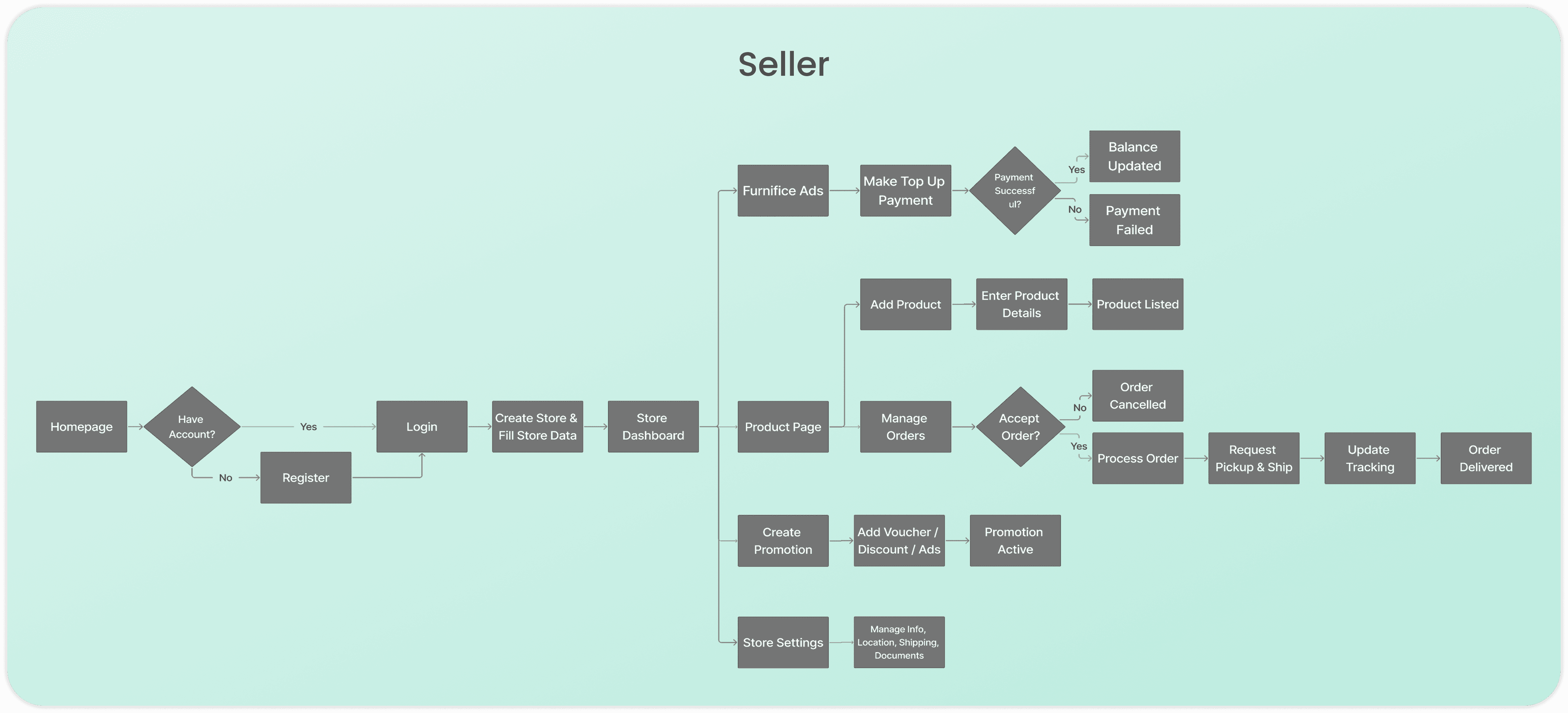
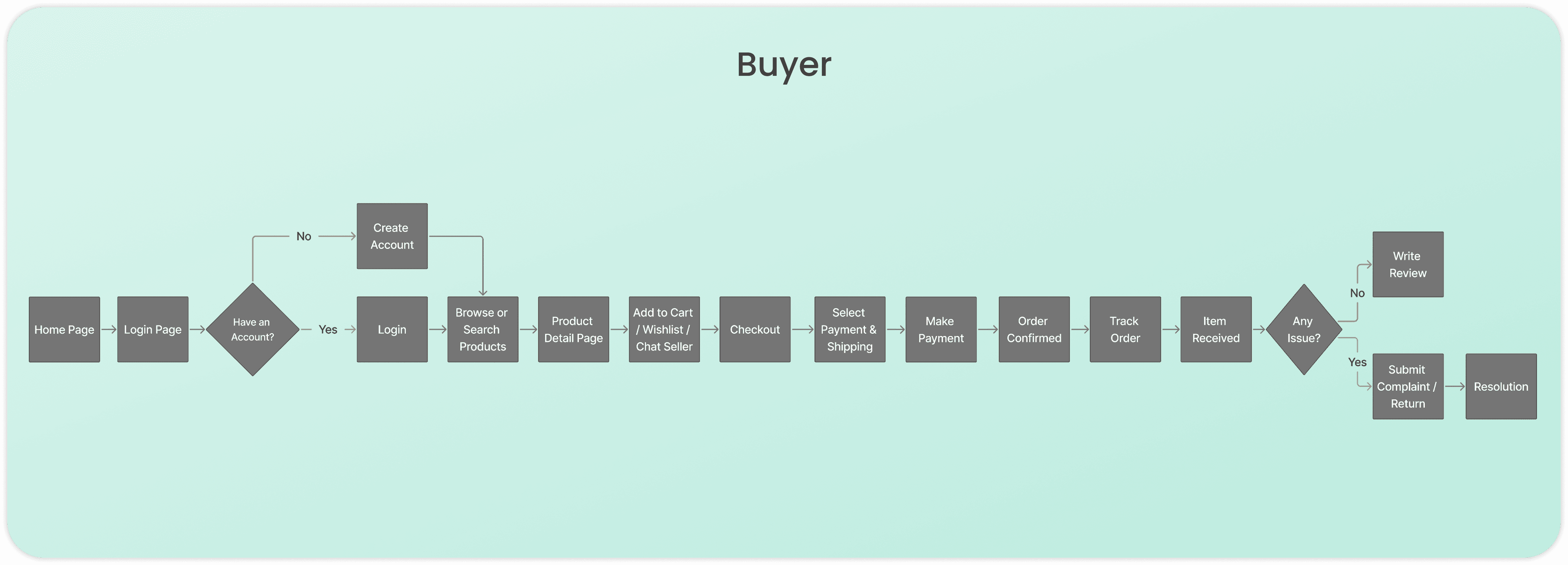
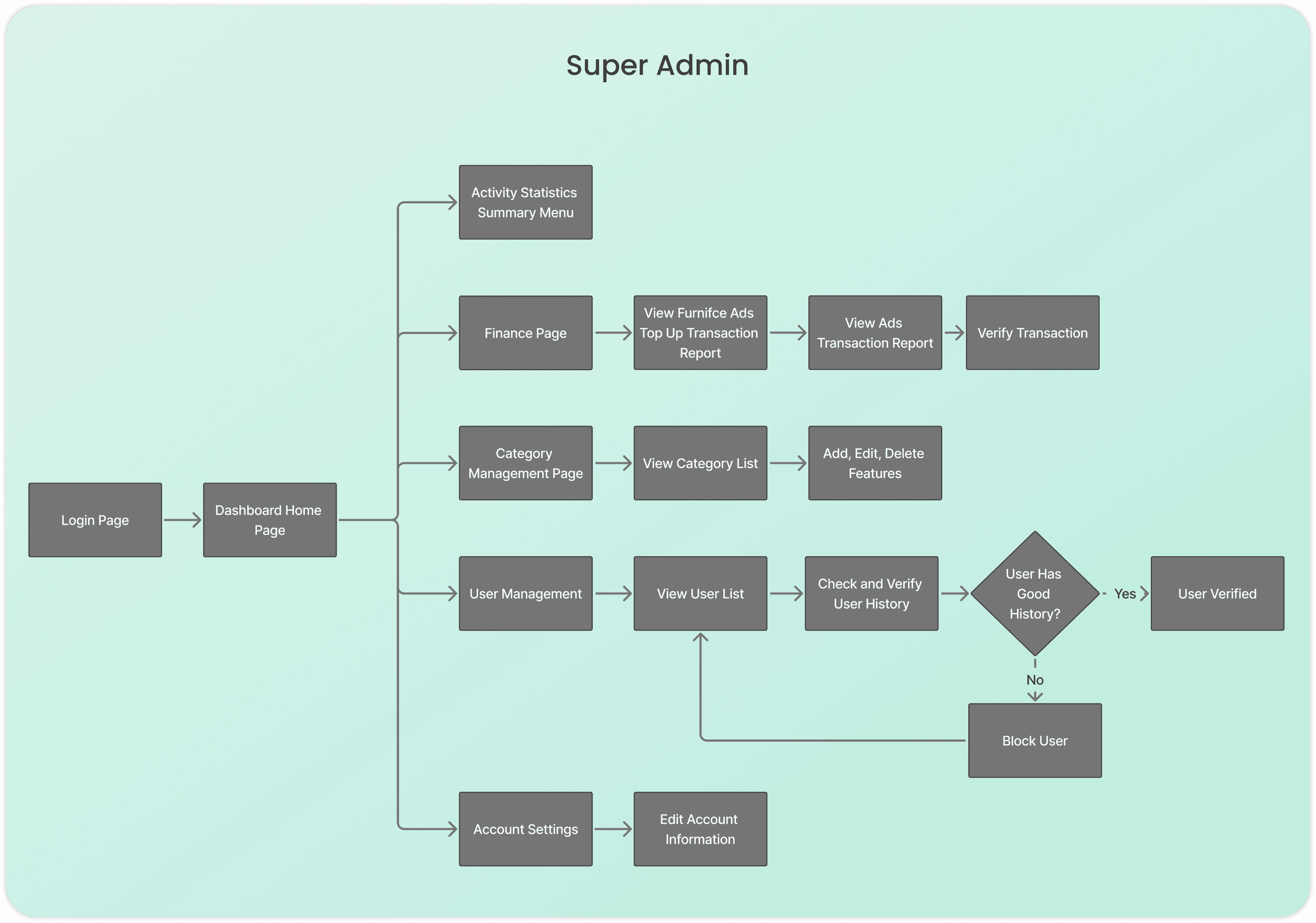
User Flow
I design these User Flows to map out logical paths that resolve system friction and ensure a seamless experience. This process transforms my ideation into a direct, functional response to the user's core needs.
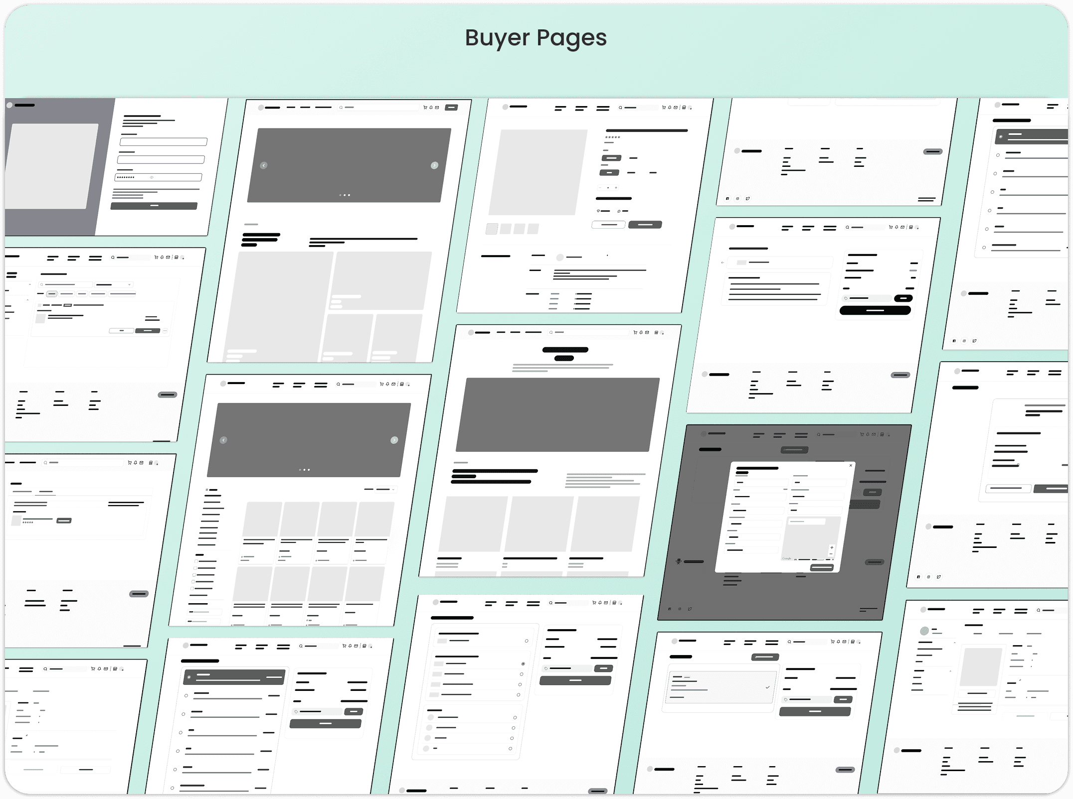
Wireframe
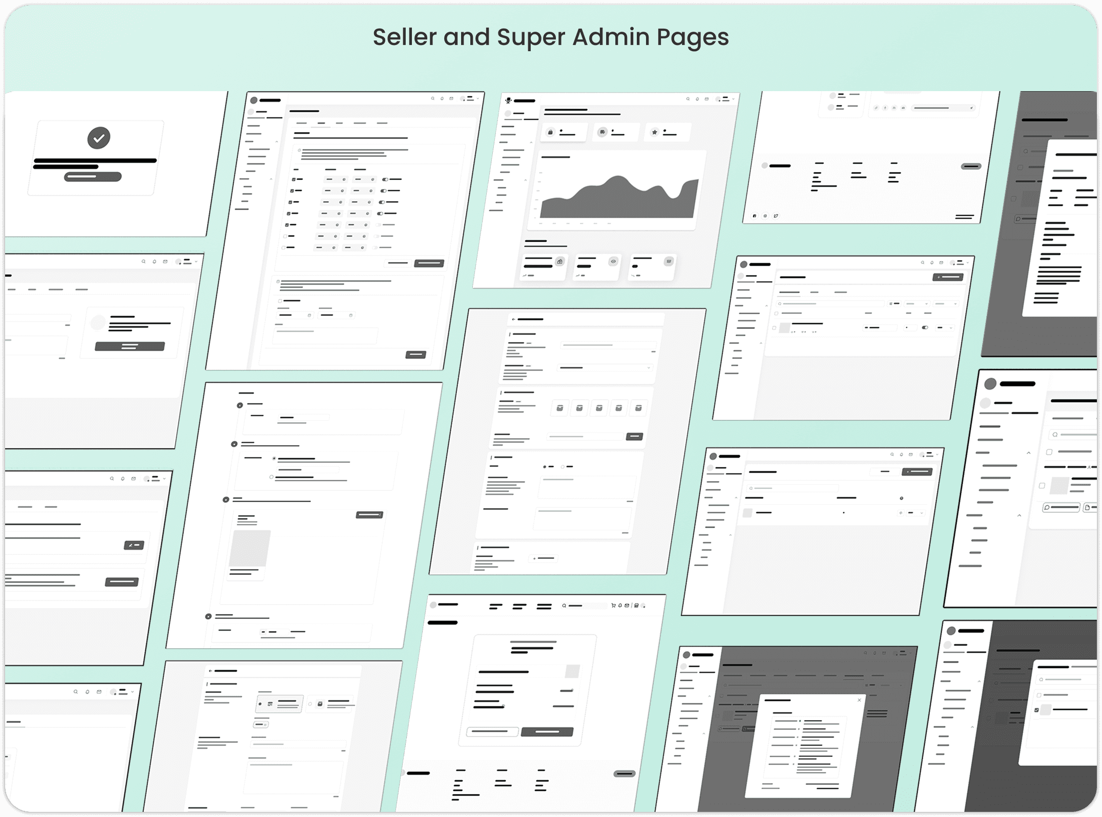
I design Wireframes as functional blueprints to structure an intuitive experience where critical tools are placed exactly where the user needs them. While Seller and Super Admin pages share a dashboard layout for efficient oversight, Buyer pages utilize a conversion-focused structure for a seamless shopping journey.
Prototype
I develop Prototypes to transform static designs into an interactive experience that validates user friction before development. By applying the Design System, I ensure visual consistency across the UI to create a functional simulation that truly delivers on the core needs of Seller, Super Admin, and Buyer.
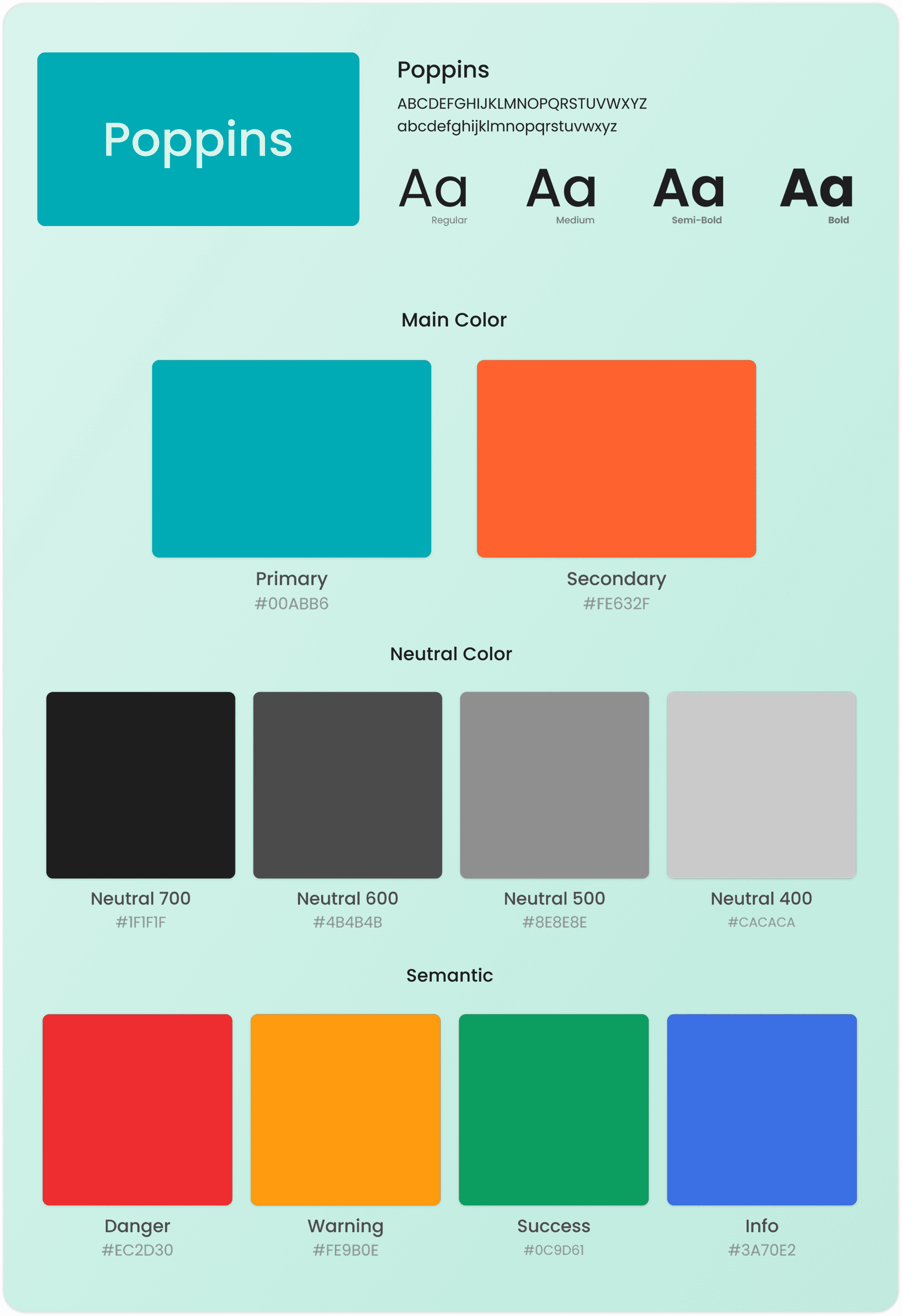
Design System
I establish this Design System to ensure visual consistency and a professional experience across every interface. I use Poppins for its high readability and a strategic color palette to create a clear hierarchy that directly serves the user's needs for clarity and accessibility.
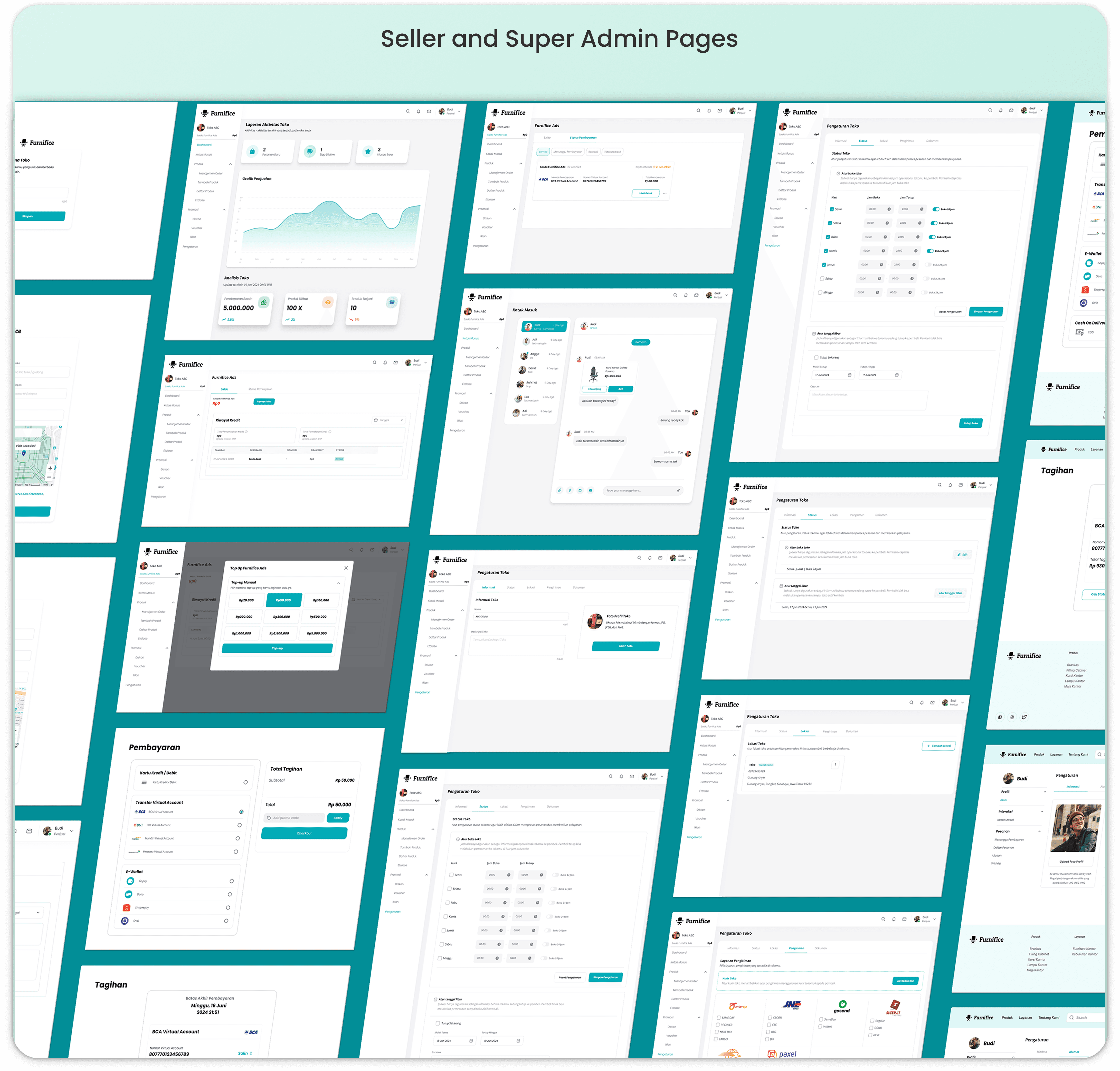
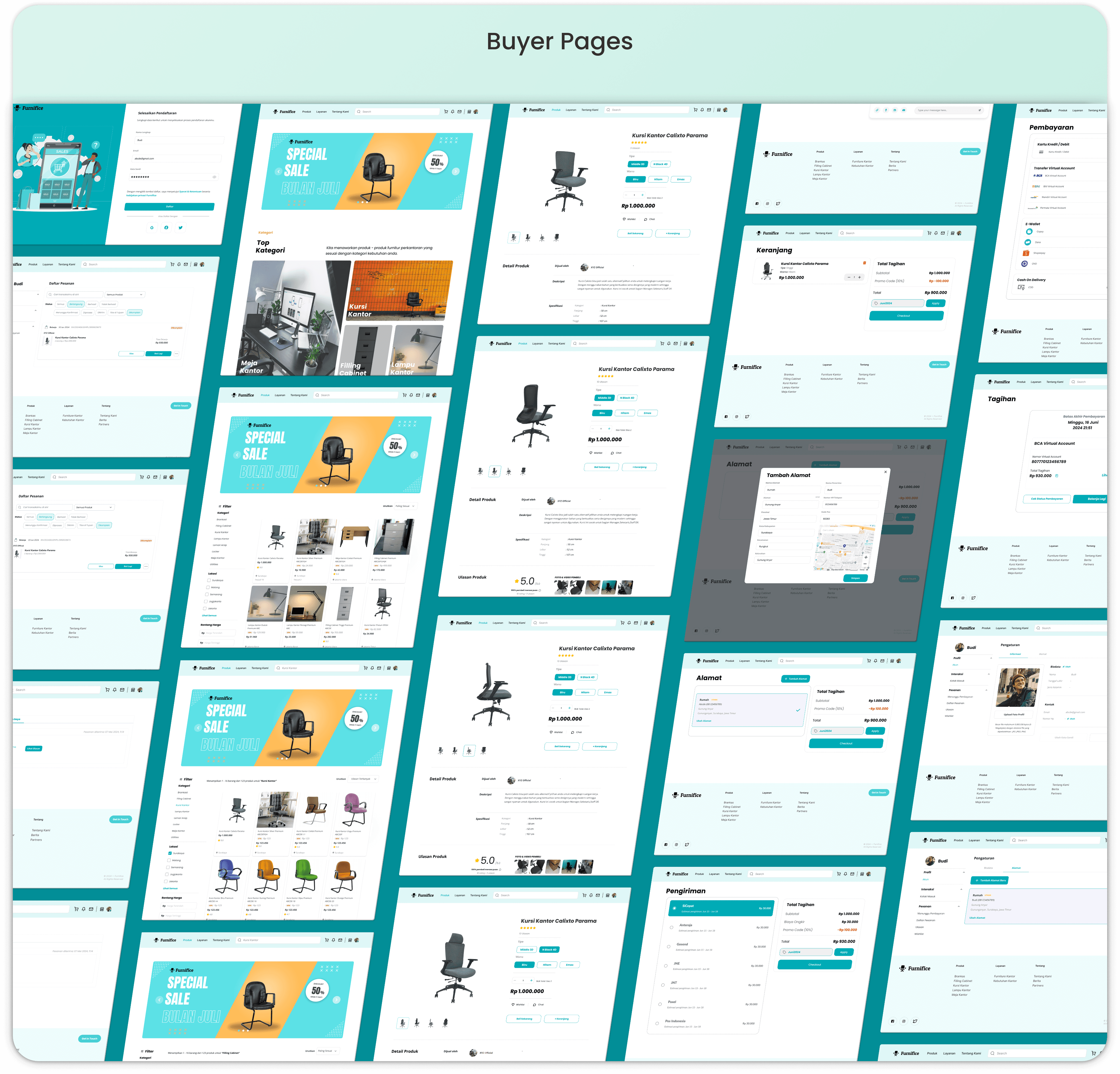
UI Design
I develop these UI Designs to transform wireframes into high-fidelity interfaces that prioritize a seamless, professional experience. While the Seller and Super Admin pages use a structured dashboard for efficient management, the Buyer pages focus on a clean, conversion driven layout to simplify the user's path to purchase.
Test
I conduct Testing through Initial Usability Testing, Heuristic Evaluation, and a Usability Test Summary to catch navigation struggles and align with industry standards. This process validates that every interaction directly serves the user's need for a clear, effortless experience.
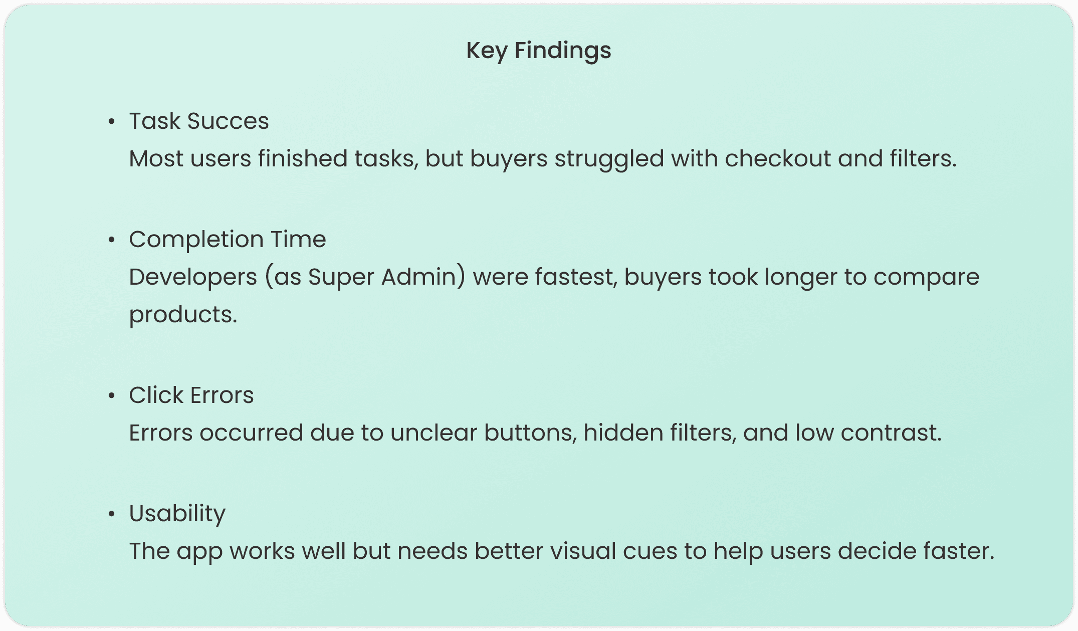
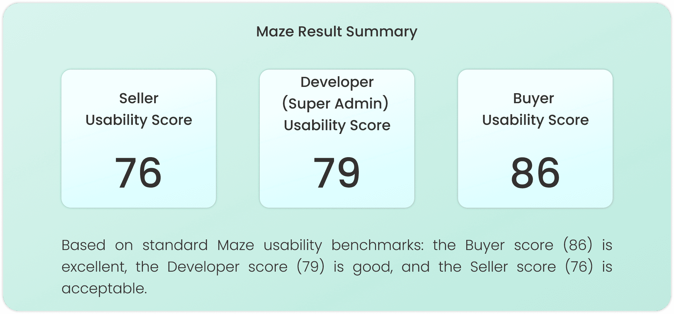
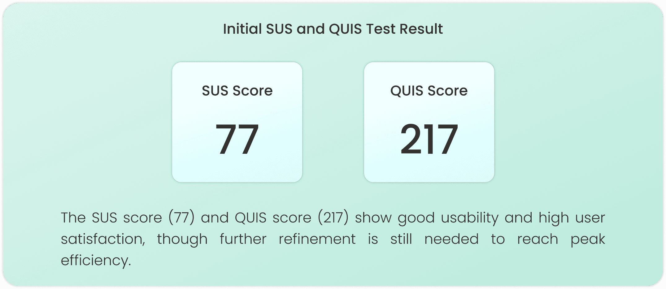
Initial Usability Testing
This process shows results from Maze tests, System Usability Scale (SUS), and Questionnaire for User Interaction Satisfaction (QUIS) completed by 5 each users of buyer, seller, and developer (super admin).
Heuristic Evaluation
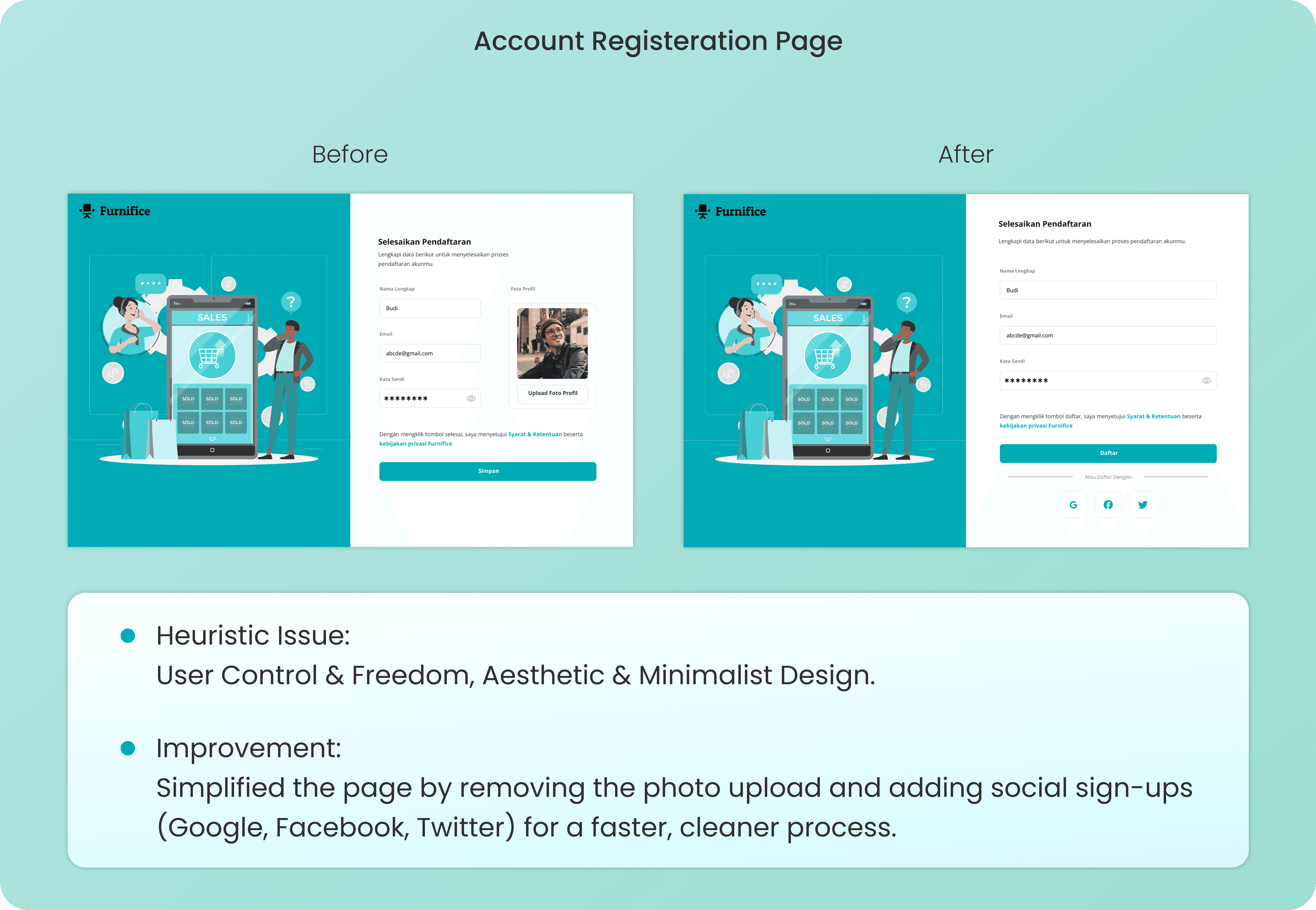
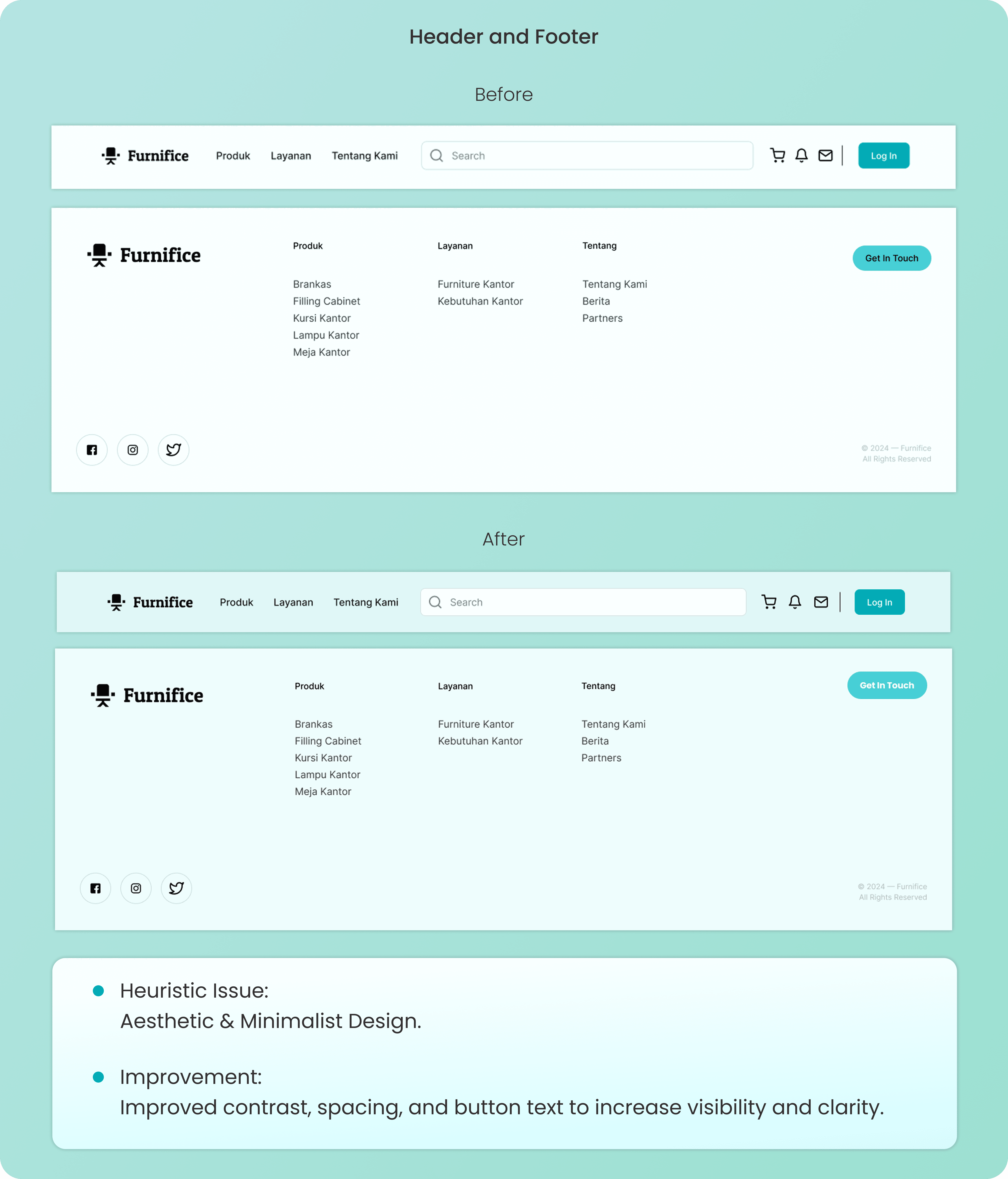
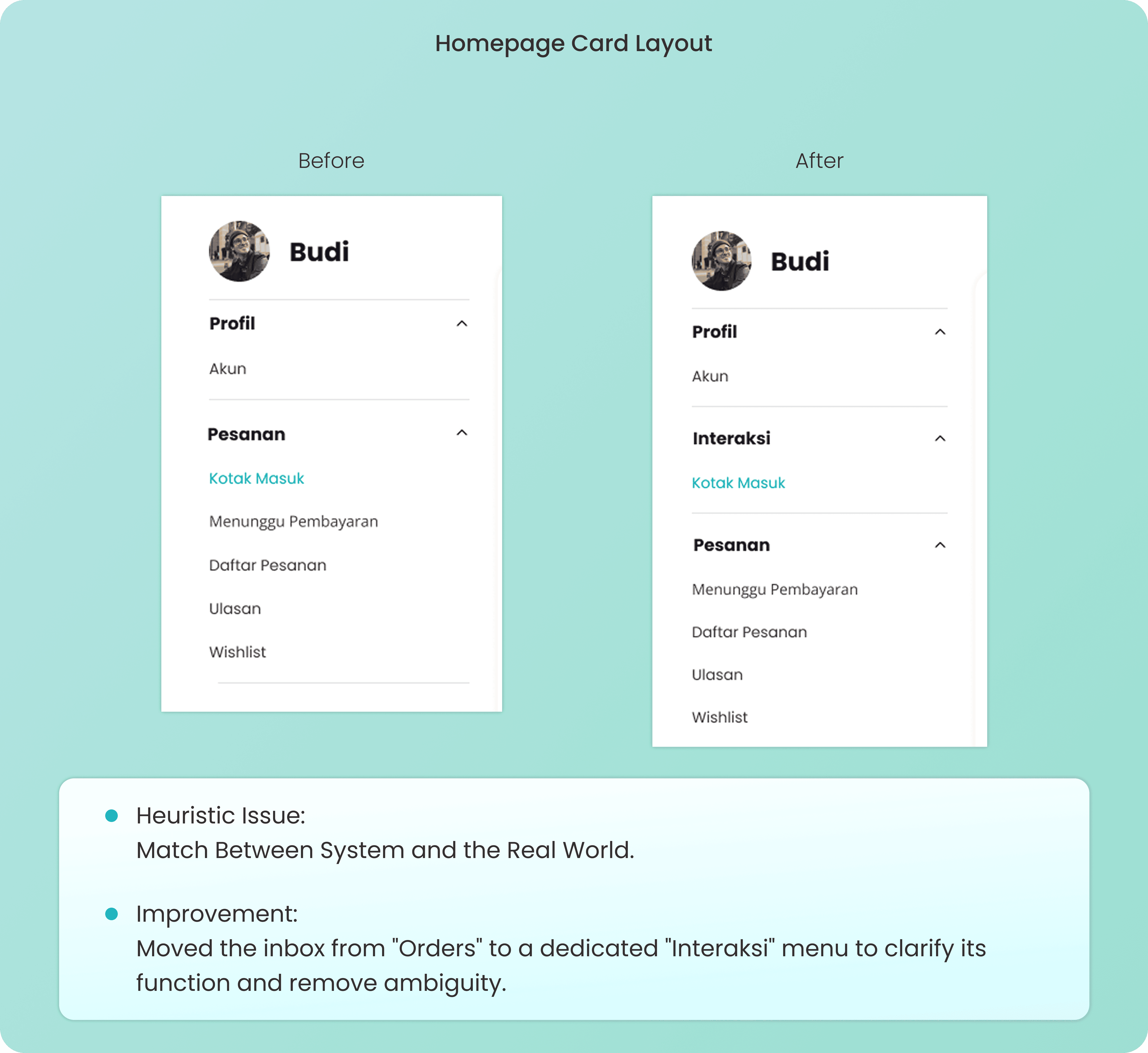
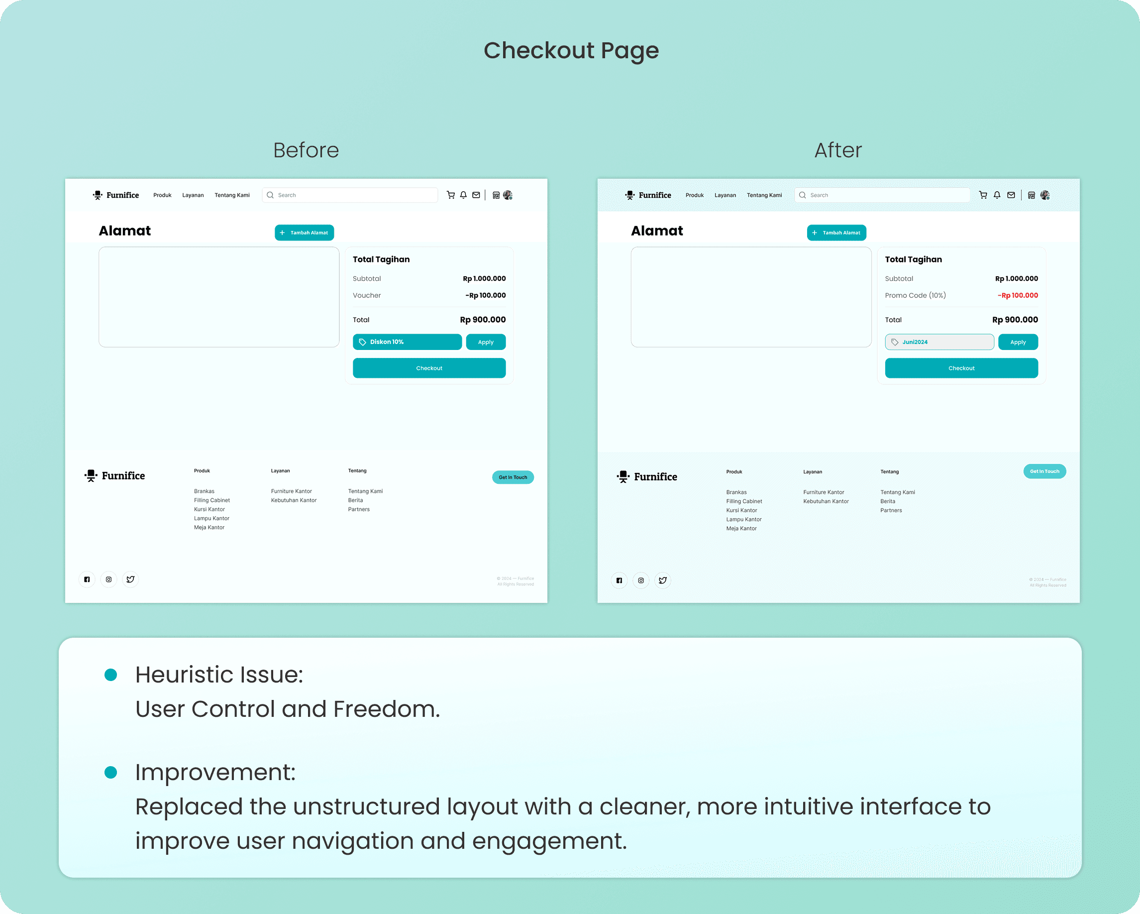
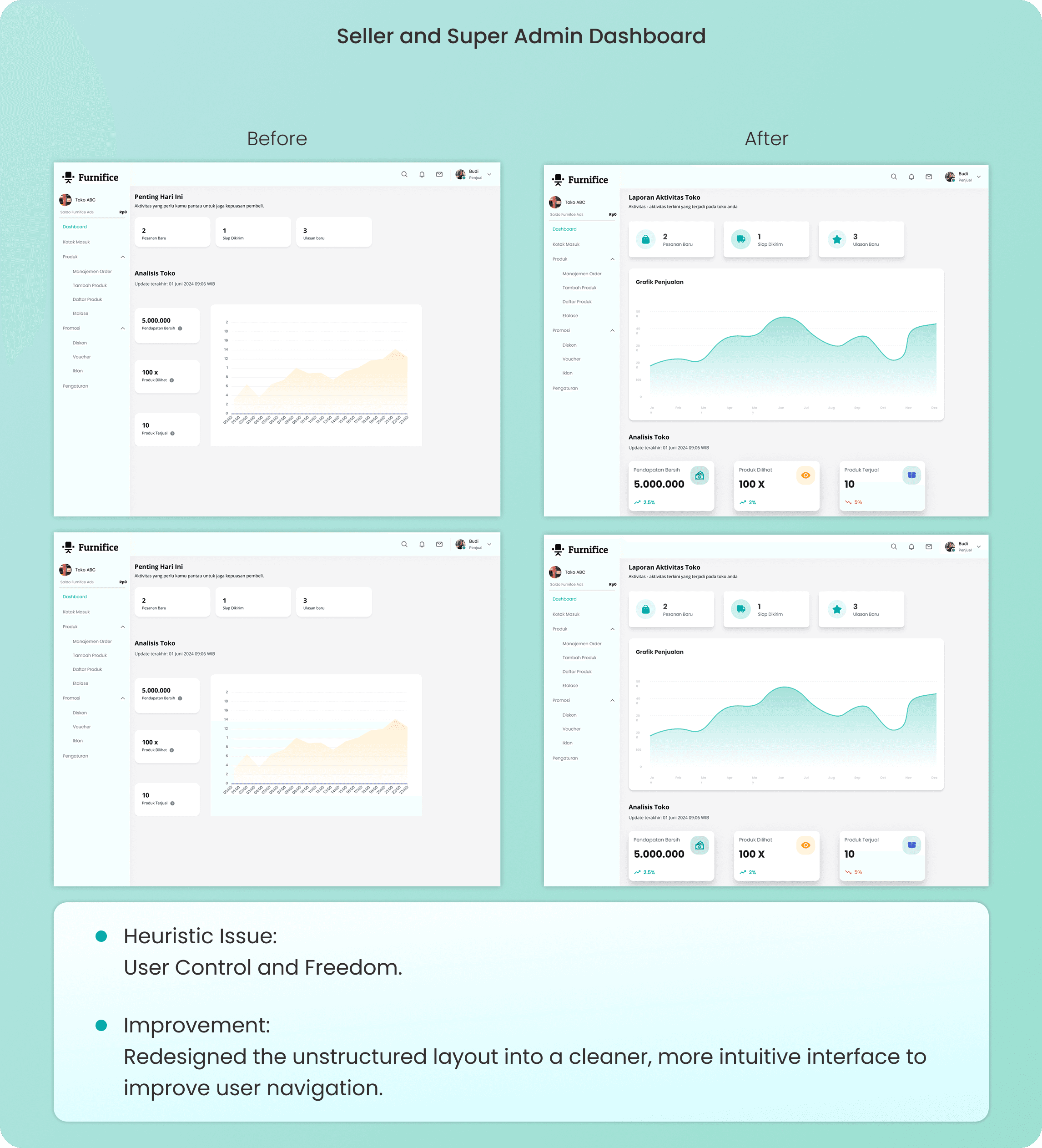
I use Heuristic Evaluation to audit designs against industry standards, fixing navigation struggles like complex registration or unclear dashboards. By comparing "Before" and "After" versions, I ensure every interface directly serves the user's need for an intuitive experience.
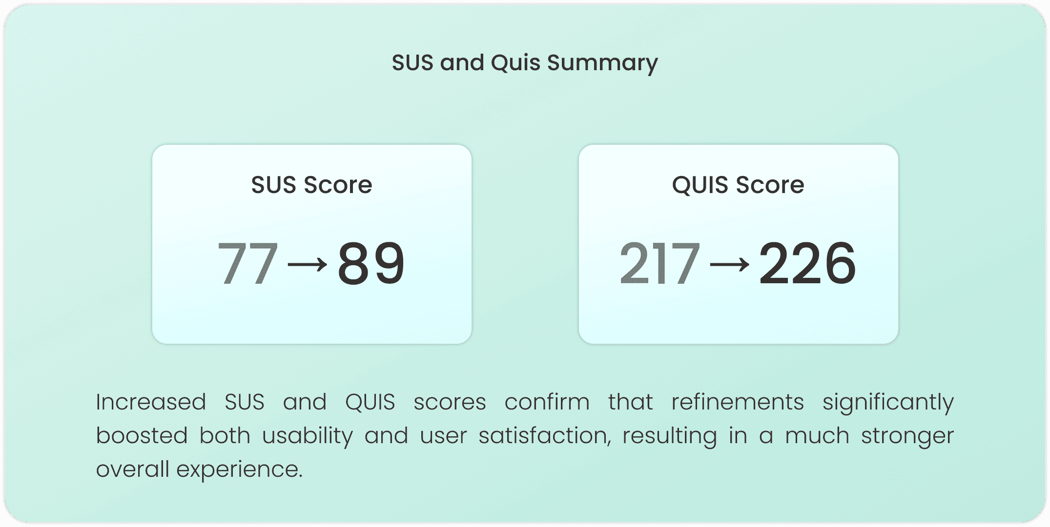
Usability Test Summary
Refinements from heuristic evaluations and usability tests improved navigation and clarity, significantly boosting both SUS and QUIS scores in the latest iteration.
Conclusion
Furnifice was my thesis project, so this was the most invested I've been in any project from start to finish. Going through the full Design Thinking process, real interviews, empathy maps, usability testing, heuristic evaluation, all of it, across three very different user types was a lot to manage. But it also gave me the clearest picture I've ever had of what it actually takes to design something that works for more than one person at a time.
What I Learned
Research is the foundation of everything. Interviewing 15 users per group before touching any design meant every decision had a real reason behind it. The empathy maps and affinity diagram turned a lot of raw conversations into actual design direction.
Designing for multiple users in one platform is a balancing act. Seller dashboard, buyer experience, and super admin panel all had to feel right for their own context. The moment I stopped thinking about them separately, the design started getting confusing.
Heuristic evaluation taught me to audit my own work properly. Going through each screen against usability standards caught issues I was too close to the design to notice on my own. Comparing before and after versions made it clear how much small fixes actually add up.
Testing is what separates a good design from a finished one. The SUS and QUIS scores improving between iterations wasn't just a number, it meant real navigation problems got fixed because actual users pointed them out.
Website of Furnfice - Furniture Office Marketplace
Furnifice is my thesis project, a marketplace platform built to bring office furniture trade fully online. Instead of scattered listings and offline dealings, it brings sellers and buyers into one place where buyers can browse and purchase with ease, while sellers and admins get their own dedicated dashboards to manage inventory, orders, and users without the usual hassle.
Client:
Personal Project
Year:
2024
Type:
Website
Role:
UI/UX Designer
Problem Statment
Office furniture sellers lack online visibility to reach more buyers, while buyers face inaccurate product data, fragmented payments, and unreliable shipping.
Goal
Build a platform that expands seller reach through promotion tools and gives buyers accurate product info, secure payments, and reliable order tracking.
The Design Thinking Process
I used the Design Thinking process to deeply understand seller and buyer pain points, define the core problem, ideate the right solutions, prototype key user flows, and validate the design through testing.
Empathize
I interviewed Sellers struggling with limited market reach, Buyers frustrated with inaccurate product info and unreliable service, and Developers as Super Admin dealing with complex system and user management. Their pain points and needs were mapped through empathy maps to guide the design direction.
Understanding Users Through Interviews
I conducted 15 interviews per user across three user groups: Sellers, Buyers, and Developers as Super Admin, to uncover their workflow challenges, pain points, and feature needs as the design foundation.
Empathy Map
I mapped what each user says, thinks, does, and feels to deeply understand their pain points and needs, revealing that Sellers need better reach and promo tools, Buyers need product clarity and reliable service, and Developers as Super Admin need a structured and manageable system.
Define
I identified five key pain points through an affinity diagram: Promotion, Payment, Shipping, Product Information, and System Management, then translated them into early ideation solutions and three user personas representing Sellers, Buyers, and Developers as Super Admin.
Affinity Diagram
I grouped research findings into five Key Pain Points: Promotion, Payment, Shipping, Product Information, and System Management, each matched with an Early Ideation solution to address the real needs of all three users.
User Persona
I created three personas to humanize the research: Sellers with limited digital visibility, Buyers frustrated by unclear product info and unreliable delivery, and Developers as Super Admin overwhelmed by complex system demands.
Ideate
I explored solutions for each user's pain points using the How Might We framework, then structured them into user flows and wireframes to shape the design direction before prototyping.
How Might We (HMW)
I reframe user pain points into How Might We questions to turn a struggle into a design opportunity. This ensures my final ideation is a direct, purposeful response to the user's specific needs.
User Flow
I design these User Flows to map out logical paths that resolve system friction and ensure a seamless experience. This process transforms my ideation into a direct, functional response to the user's core needs.
Wireframe
I design Wireframes as functional blueprints to structure an intuitive experience where critical tools are placed exactly where the user needs them. While Seller and Super Admin pages share a dashboard layout for efficient oversight, Buyer pages utilize a conversion-focused structure for a seamless shopping journey.
Prototype
I develop Prototypes to transform static designs into an interactive experience that validates user friction before development. By applying the Design System, I ensure visual consistency across the UI to create a functional simulation that truly delivers on the core needs of Seller, Super Admin, and Buyer.
Design System
I establish this Design System to ensure visual consistency and a professional experience across every interface. I use Poppins for its high readability and a strategic color palette to create a clear hierarchy that directly serves the user's needs for clarity and accessibility.
UI Design
I develop these UI Designs to transform wireframes into high-fidelity interfaces that prioritize a seamless, professional experience. While the Seller and Super Admin pages use a structured dashboard for efficient management, the Buyer pages focus on a clean, conversion driven layout to simplify the user's path to purchase.
Test
I conduct Testing through Initial Usability Testing, Heuristic Evaluation, and a Usability Test Summary to catch navigation struggles and align with industry standards. This process validates that every interaction directly serves the user's need for a clear, effortless experience.
Initial Usability Testing
This process shows results from Maze tests, System Usability Scale (SUS), and Questionnaire for User Interaction Satisfaction (QUIS) completed by 5 each users of buyer, seller, and developer (super admin).
Heuristic Evaluation
I use Heuristic Evaluation to audit designs against industry standards, fixing navigation struggles like complex registration or unclear dashboards. By comparing "Before" and "After" versions, I ensure every interface directly serves the user's need for an intuitive experience.
Usability Test Summary
Refinements from heuristic evaluations and usability tests improved navigation and clarity, significantly boosting both SUS and QUIS scores in the latest iteration.
Conclusion
Furnifice was my thesis project, so this was the most invested I've been in any project from start to finish. Going through the full Design Thinking process, real interviews, empathy maps, usability testing, heuristic evaluation, all of it, across three very different user types was a lot to manage. But it also gave me the clearest picture I've ever had of what it actually takes to design something that works for more than one person at a time.
What I Learned
Research is the foundation of everything. Interviewing 15 users per group before touching any design meant every decision had a real reason behind it. The empathy maps and affinity diagram turned a lot of raw conversations into actual design direction.
Designing for multiple users in one platform is a balancing act. Seller dashboard, buyer experience, and super admin panel all had to feel right for their own context. The moment I stopped thinking about them separately, the design started getting confusing.
Heuristic evaluation taught me to audit my own work properly. Going through each screen against usability standards caught issues I was too close to the design to notice on my own. Comparing before and after versions made it clear how much small fixes actually add up.
Testing is what separates a good design from a finished one. The SUS and QUIS scores improving between iterations wasn't just a number, it meant real navigation problems got fixed because actual users pointed them out.