
Landing Page of Itadaku Ramen - Japanese Restaurant
Itadaku Ramen is a fictional brand made for a mini project at MyEduSolve UI/UX Design Class, the inspiration from the love for Japanese food, especially ramen. ‘Itadaku’ (いただく) is a basic word from ‘Itadakimasu’ (いただきます) means ‘i humbly receive’, and ‘Ramen’ (らーめん) is a Japanese noddle.
Client:
Personal Project
Year:
2022
Type:
Website
Role:
UI/UX Designer, Illustrator
Goal
Create a cohesive landing page that clearly represents the brand completely using Adobe Illustrator.
Logo Ideation
The inspiration came from the Japan word “Itadakimasu.” It’s also a common word for Japanese people to say before eating as express thanks to whoever prepares the food. The approach is to mix the “Itadakimasu” and “Ramen” words and symbolism as the face of our brand. This logo allows flexibility for a bigger change in the future.
Logomark
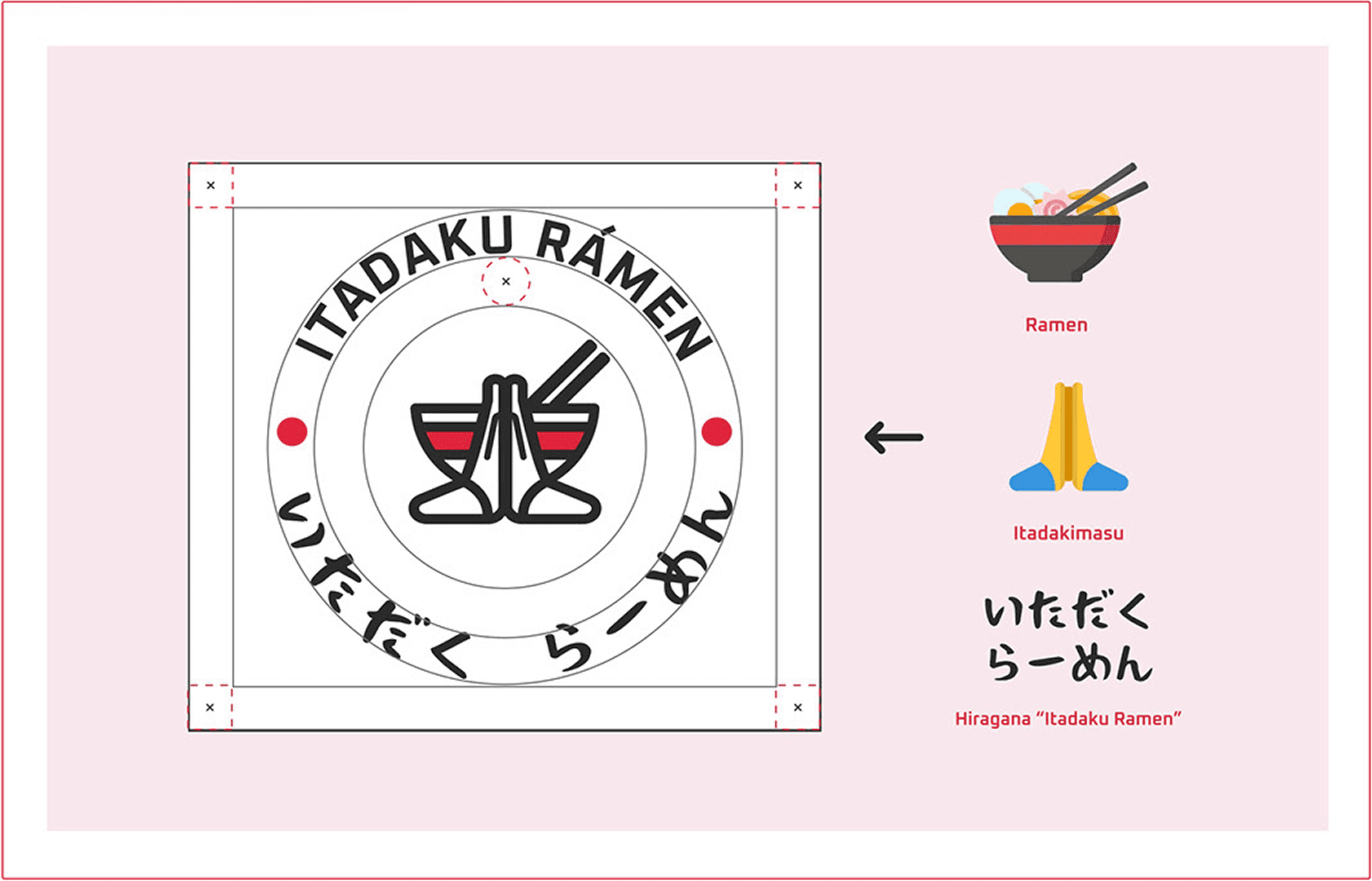
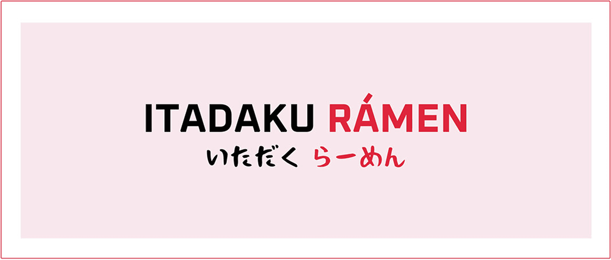
Wordmark
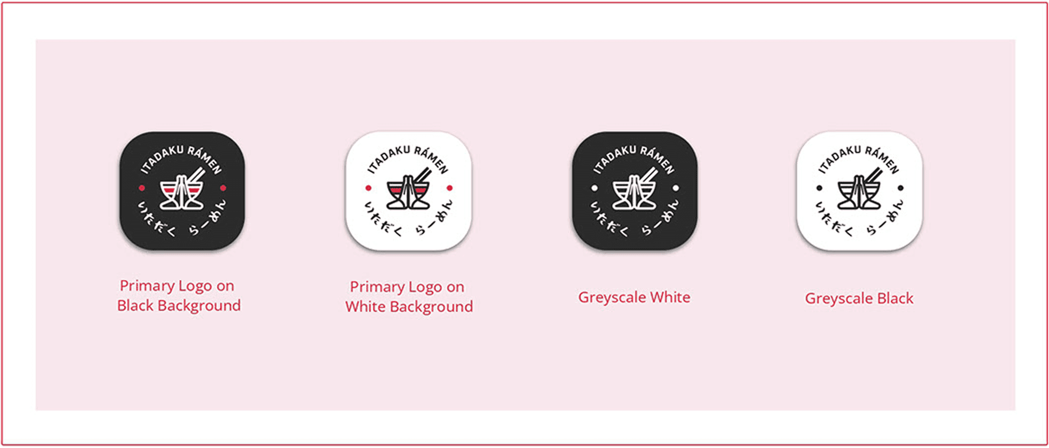
Variation
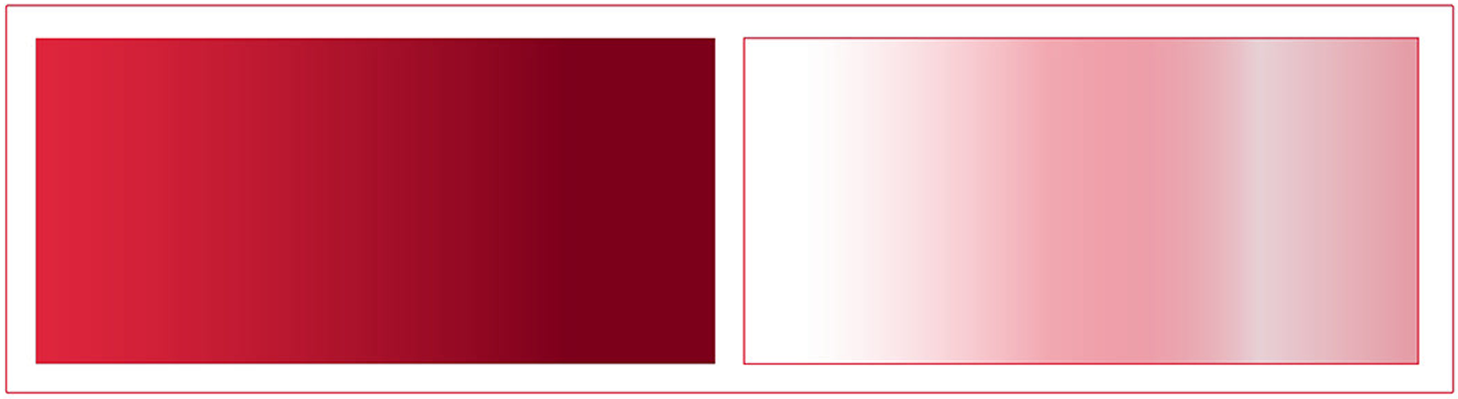
Color
The main color is red and white, as a representative of the Japanese flag. It can attract and make people hungry. Using this color with the hope can propel Itadaku Ramen into the global future. I ensure the presence of the red brand, either in composition or through the presence of logos.
Main Color
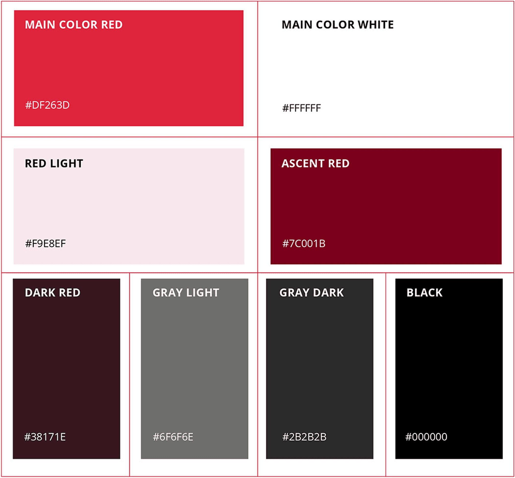
Gradient
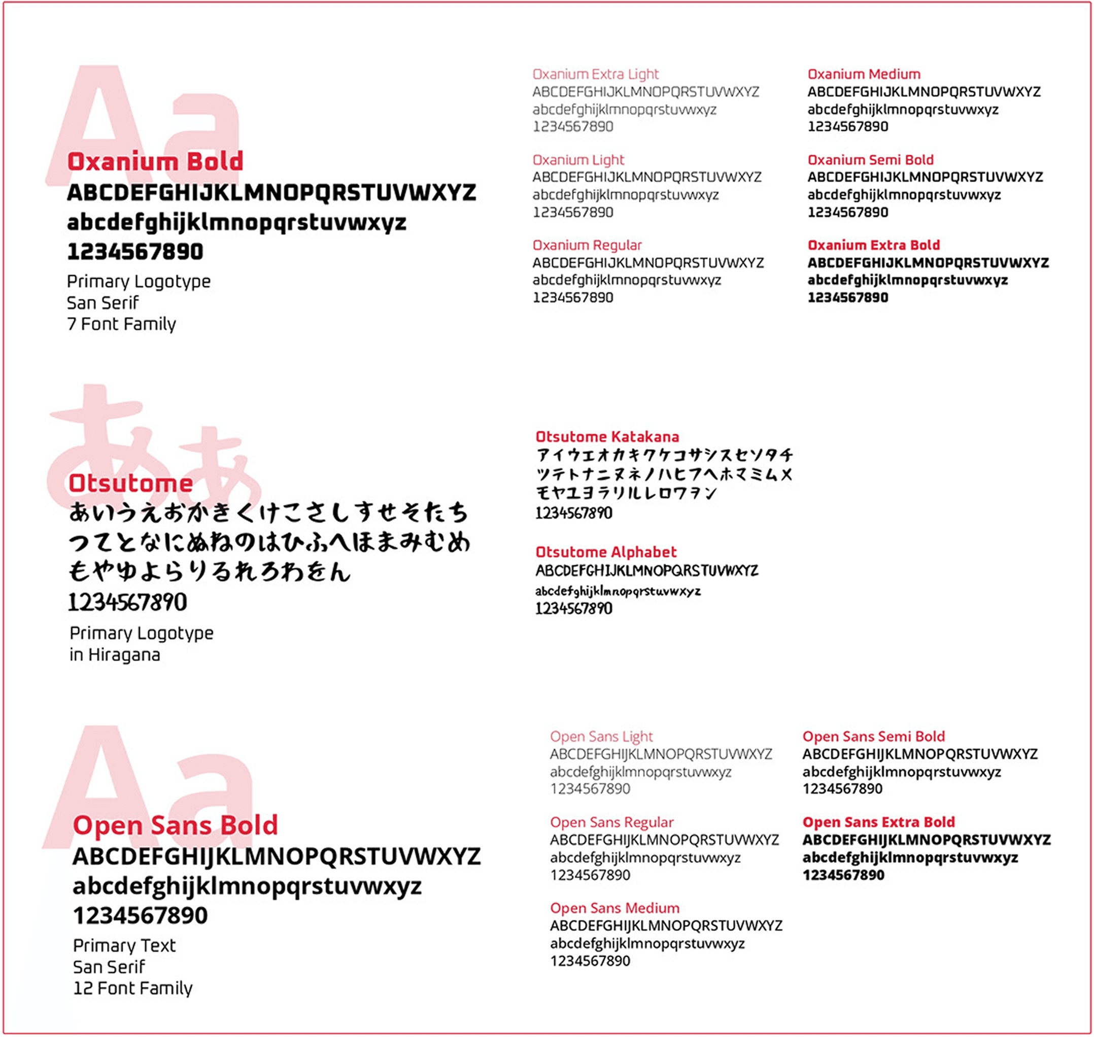
Typography
Using two fonts for logo, Oxanium and Otsutome. One font for the website design, Open Sans. This typeface has a high level of legibility and an authentic side simultaneously.
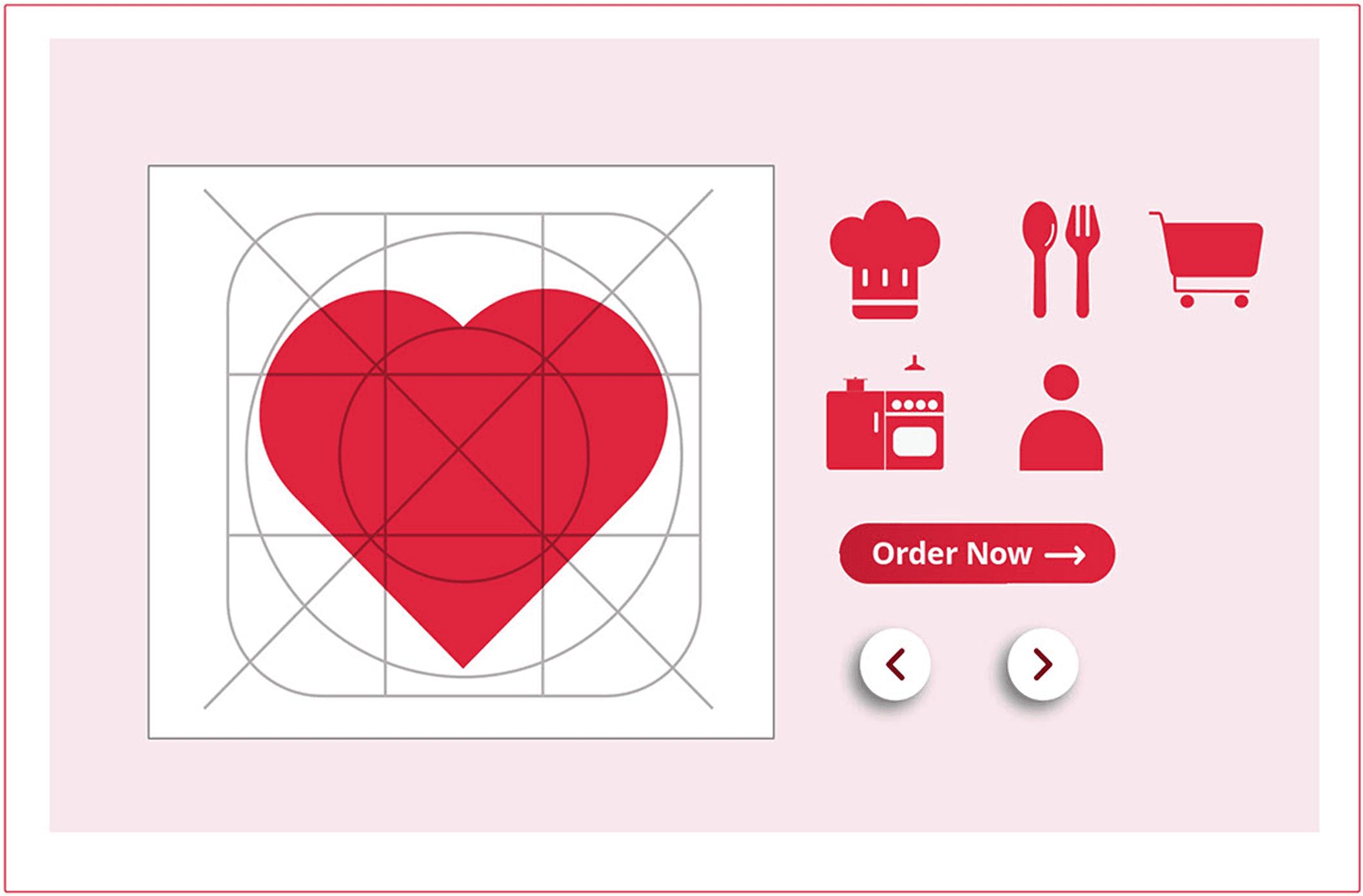
Icon & Element
Illustrate the icon and button with the fulfill type to make it visible and readable. The main shape of the icon is inspired by objects related to food.
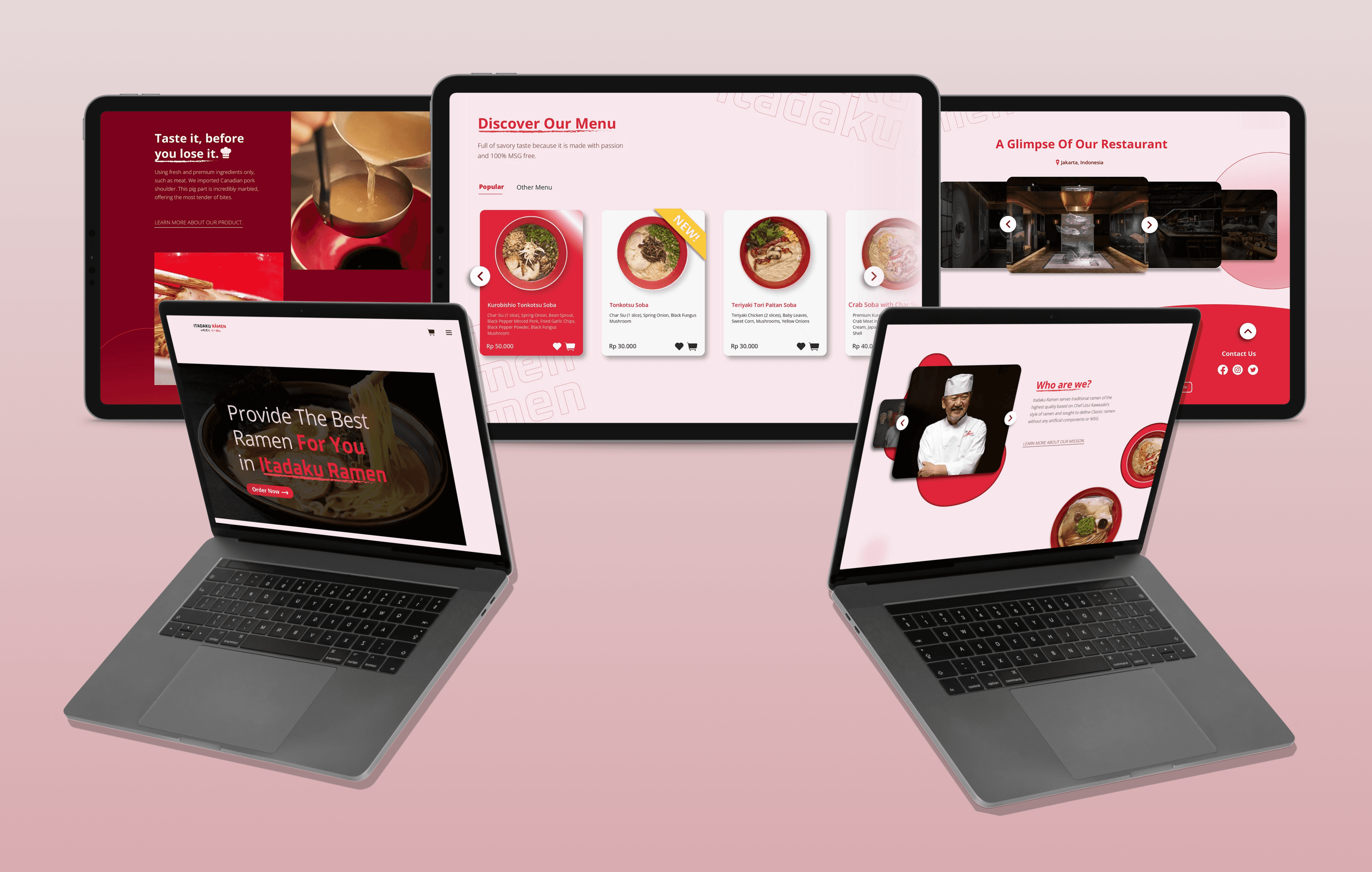
The Landing Page Design
This design uses a bold red and white palette with rounded geometry to create a modern, high-conversion layout. It features an interactive menu with high-resolution dish cards and a horizontal carousel showcasing the restaurant's interior to build authenticity.

Conclusion
Itadaku Ramen was a mini project from MyEduSolve UI/UX Design Class and everything in it, the logo, illustrations, icons, and the full landing page, was built from scratch using Adobe Illustrator. It was my first time handling both the brand identity and the page design in one project entirely through illustration, which made the process feel very different from how I usually work.
What I Learned
Building everything from scratch in Illustrator taught me to be more intentional. Every shape, icon, and element had to be illustrate manually, so there was no room to just drop in a component and move on. That constraint actually made me think harder about each visual decision.
Doing the illustration and the layout design together changed how I approached both. I had to think about how the assets I was illustrate would actually fit and feel on the page at the same time. It made me realize how much illustration and UI design can inform each other when you're doing them simultaneously.
Landing Page of Itadaku Ramen - Japanese Restaurant
Itadaku Ramen is a fictional brand made for a mini project at MyEduSolve UI/UX Design Class, the inspiration from the love for Japanese food, especially ramen. ‘Itadaku’ (いただく) is a basic word from ‘Itadakimasu’ (いただきます) means ‘i humbly receive’, and ‘Ramen’ (らーめん) is a Japanese noddle.
Client:
Personal Project
Year:
2022
Type:
Website
Role:
UI/UX Designer, Illustrator
Goal
Create a cohesive landing page that clearly represents the brand completely using Adobe Illustrator.
Logo Ideation
The inspiration came from the Japan word “Itadakimasu.” It’s also a common word for Japanese people to say before eating as express thanks to whoever prepares the food. The approach is to mix the “Itadakimasu” and “Ramen” words and symbolism as the face of our brand. This logo allows flexibility for a bigger change in the future.
Logomark
Wordmark
Variation
Color
The main color is red and white, as a representative of the Japanese flag. It can attract and make people hungry. Using this color with the hope can propel Itadaku Ramen into the global future. I ensure the presence of the red brand, either in composition or through the presence of logos.
Main Color
Gradient
Typography
Using two fonts for logo, Oxanium and Otsutome. One font for the website design, Open Sans. This typeface has a high level of legibility and an authentic side simultaneously.
Icon & Element
Illustrate the icon and button with the fulfill type to make it visible and readable. The main shape of the icon is inspired by objects related to food.
The Landing Page Design
This design uses a bold red and white palette with rounded geometry to create a modern, high-conversion layout. It features an interactive menu with high-resolution dish cards and a horizontal carousel showcasing the restaurant's interior to build authenticity.
Conclusion
Itadaku Ramen was a mini project from MyEduSolve UI/UX Design Class and everything in it, the logo, illustrations, icons, and the full landing page, was built from scratch using Adobe Illustrator. It was my first time handling both the brand identity and the page design in one project entirely through illustration, which made the process feel very different from how I usually work.
What I Learned
Building everything from scratch in Illustrator taught me to be more intentional. Every shape, icon, and element had to be illustrate manually, so there was no room to just drop in a component and move on. That constraint actually made me think harder about each visual decision.
Doing the illustration and the layout design together changed how I approached both. I had to think about how the assets I was illustrate would actually fit and feel on the page at the same time. It made me realize how much illustration and UI design can inform each other when you're doing them simultaneously.