
Company Profile Website of PT Sinergi Gula Nusantara
PT Sinergi Gula Nusantara (SGN) is Indonesia's Sugar Sub Holding under PTPN III, managing multiple sugar mills nationwide to support national sugar self sufficiency and modernize the state owned sugar supply chain.
Client:
PT Sinergi Gula Nusantara
Year:
2025
Type:
Website
Role:
UI/UX Designer
Problem Statement
The previous website looked outdated, had unclear content structure, inconsistent visuals, and difficult navigation. It did not effectively represent SGN’s scale or professionalism.
Goal
The redesign aimed to create a clean user-friendly website that improves readability, visual consistency, and navigation while better reflecting SGN’s corporate identity.
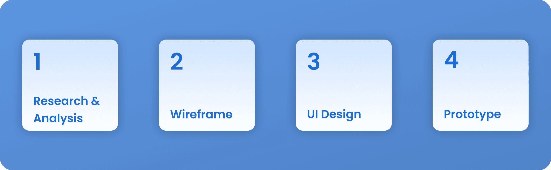
The Design Process
Starting with research to identify user problems, I built wireframes to plan layouts, established a design system for consistent styling, crafted the final UI, and developed a prototype to test the experience.
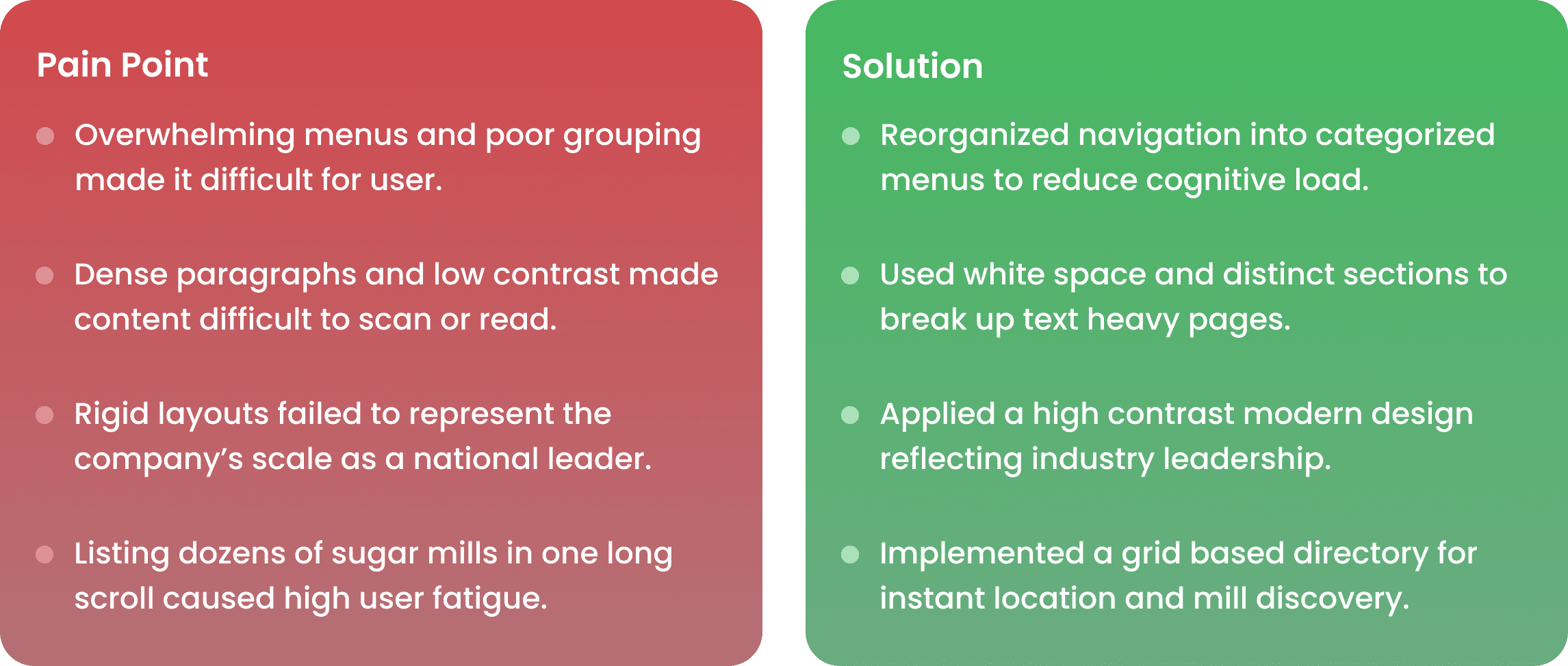
Paint Point & Solution
I identified user problems from direct feedback and requests, to solve user confusion and fatigue, I reorganized the navigation and updated the branding.
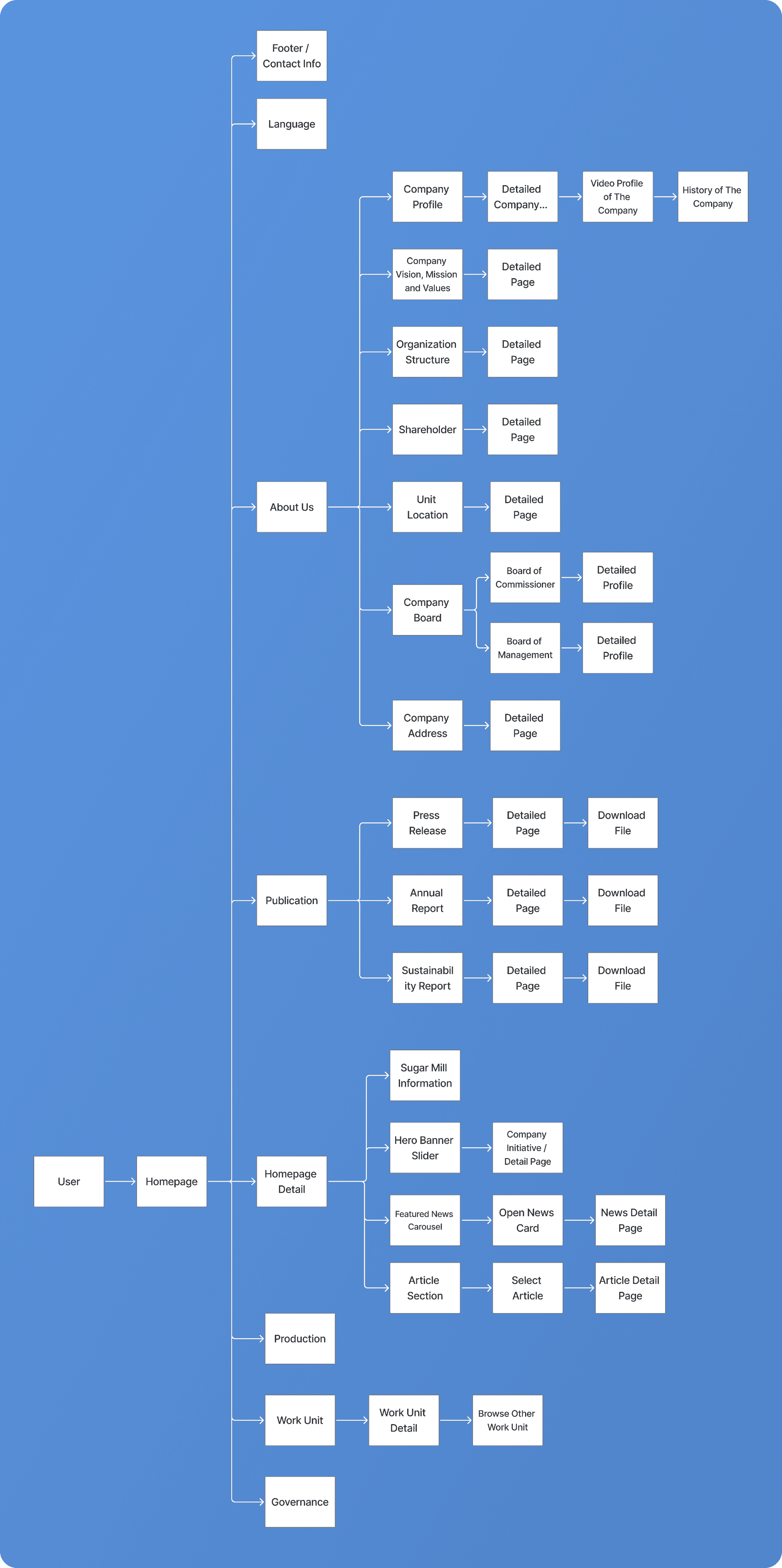
User Flow
I redesigned this flow to kill the navigation fatigue that was slowing people down, it’s a direct path that cuts out the noise and lets the company’s brand shine through a smoother experience.
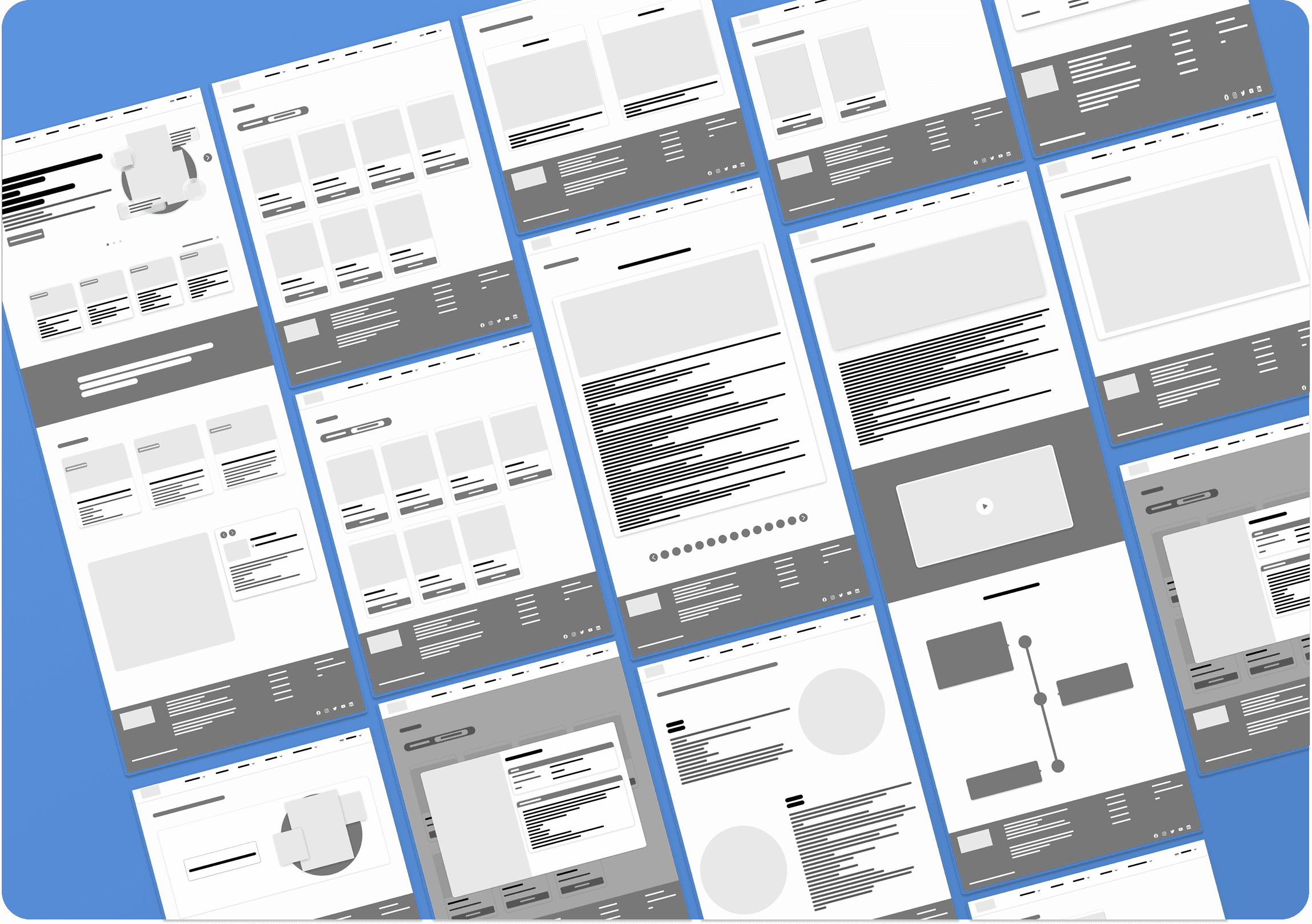
Wireframe
I Designed wireframes to transform user frustration into a structured foundation for a clean, brand-aligned UI.
Design System
I Developed a design system standardizing colors and fonts to eliminate visual inconsistency and strengthen brand identity.
Typography & Color
Component
Grid Layout
UI Design Before
The existing UI lacked visual consistency, poor hierarchy, and a cohesive brand identity.
UI Design After
I overhauled the interface to cut the old clutter and navigation hurdles. These core improvements create a clean, intuitive experience that finally represents the company’s brand.

Conclusion
SGN manages sugar mills across Indonesia, but their website didn't show it. This redesign fixed that by cleaning up the navigation, strengthening the visual identity, and building a design system that finally gives the site a presence that matches the company's scale.
What I Learned
Navigation confusion is a trust problem. When users can't find what they're looking for, they stop believing the company is competent. Fixing the flow was the most impactful change in this project.
Design systems matter. Standardizing colors, typography, and components early kept every screen consistent and saved time. On a corporate project, visual inconsistency directly damages trust.
Design from real feedback. The pain points came from actual user feedback, not assumptions. That kept every decision grounded and purposeful.
Context shapes design. SGN is a national-scale company, not a startup. The design had to feel authoritative first, modern second.
Company Profile Website of PT Sinergi Gula Nusantara
PT Sinergi Gula Nusantara (SGN) is Indonesia's Sugar Sub Holding under PTPN III, managing multiple sugar mills nationwide to support national sugar self sufficiency and modernize the state owned sugar supply chain.
Client:
PT Sinergi Gula Nusantara
Year:
2025
Type:
Website
Role:
UI/UX Designer
Problem Statement
The previous website looked outdated, had unclear content structure, inconsistent visuals, and difficult navigation. It did not effectively represent SGN’s scale or professionalism.
Goal
The redesign aimed to create a clean user-friendly website that improves readability, visual consistency, and navigation while better reflecting SGN’s corporate identity.
The Design Process
Starting with research to identify user problems, I built wireframes to plan layouts, established a design system for consistent styling, crafted the final UI, and developed a prototype to test the experience.
Paint Point & Solution
I identified user problems from direct feedback and requests, to solve user confusion and fatigue, I reorganized the navigation and updated the branding.
User Flow
I redesigned this flow to kill the navigation fatigue that was slowing people down, it’s a direct path that cuts out the noise and lets the company’s brand shine through a smoother experience.
Wireframe
I Designed wireframes to transform user frustration into a structured foundation for a clean, brand-aligned UI.
Design System
I Developed a design system standardizing colors and fonts to eliminate visual inconsistency and strengthen brand identity.
Typography & Color
Component
Grid Layout
UI Design Before
The existing UI lacked visual consistency, poor hierarchy, and a cohesive brand identity.
UI Design After
I overhauled the interface to cut the old clutter and navigation hurdles. These core improvements create a clean, intuitive experience that finally represents the company’s brand.
Conclusion
SGN manages sugar mills across Indonesia, but their website didn't show it. This redesign fixed that by cleaning up the navigation, strengthening the visual identity, and building a design system that finally gives the site a presence that matches the company's scale.
What I Learned
Navigation confusion is a trust problem. When users can't find what they're looking for, they stop believing the company is competent. Fixing the flow was the most impactful change in this project.
Design systems matter. Standardizing colors, typography, and components early kept every screen consistent and saved time. On a corporate project, visual inconsistency directly damages trust.
Design from real feedback. The pain points came from actual user feedback, not assumptions. That kept every decision grounded and purposeful.
Context shapes design. SGN is a national-scale company, not a startup. The design had to feel authoritative first, modern second.